Shared progress without ranking
Braid Camp
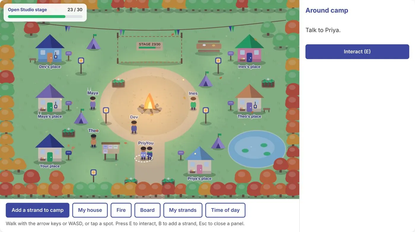
Members add a Thinking, Feeling or Doing strand and it becomes a lantern, tent or garden bed in a shared camp. No leaderboards, likes or timers.
Play Braid CampI’m a product manager in games and consumer technology with a background in digital humanities.
Taking new products from an idea to real players, as a founding product manager and as a senior product manager in games.
An AI-native platform where anyone can turn an idea into a playable game and share it. I was the first hire and owned the product from concept to launch.
6 months from concept to live on iOS and Android
A new live-service mobile game in The Sims franchise, carried from prototype through five live market tests with a studio of about 30.
28% lift in D1 retention from a new playtesting program
I was the producer, design lead and project lead for a student team that added online multiplayer to Ragnarök TD, and we shipped on schedule.
10 students, shipped on schedule
Community platforms designed for honest conversation and shared learning, built with the people who use them.
Part-time product designer, then advisor, for Braid, a vocational storytelling community from the University of Michigan. I focus on gamification and built Braid Camp, the onboarding curriculum for three kinds of members.
3 trailheads: Storytellers, Guides and Builders
An educational mobile app for a Michigan disaster-preparedness nonprofit, built as my master’s capstone to help people get ready for emergencies one small step at a time.
1st place for Civic Engagement at the U-M Project Exposition
Interactive exhibits, games and research tools built with historians and museums, before my product career.
A game set in Colonial Boston after the 1770 Boston Massacre, where players judge which accounts to trust. I built its map interface in Unity.
Map interface built in Unity
A 14-stop tour of African-American history in Westfield, New Jersey, made for the town’s 300th anniversary. I launched its online version and led its timeline research.
14 stops, from 1720 to 2020
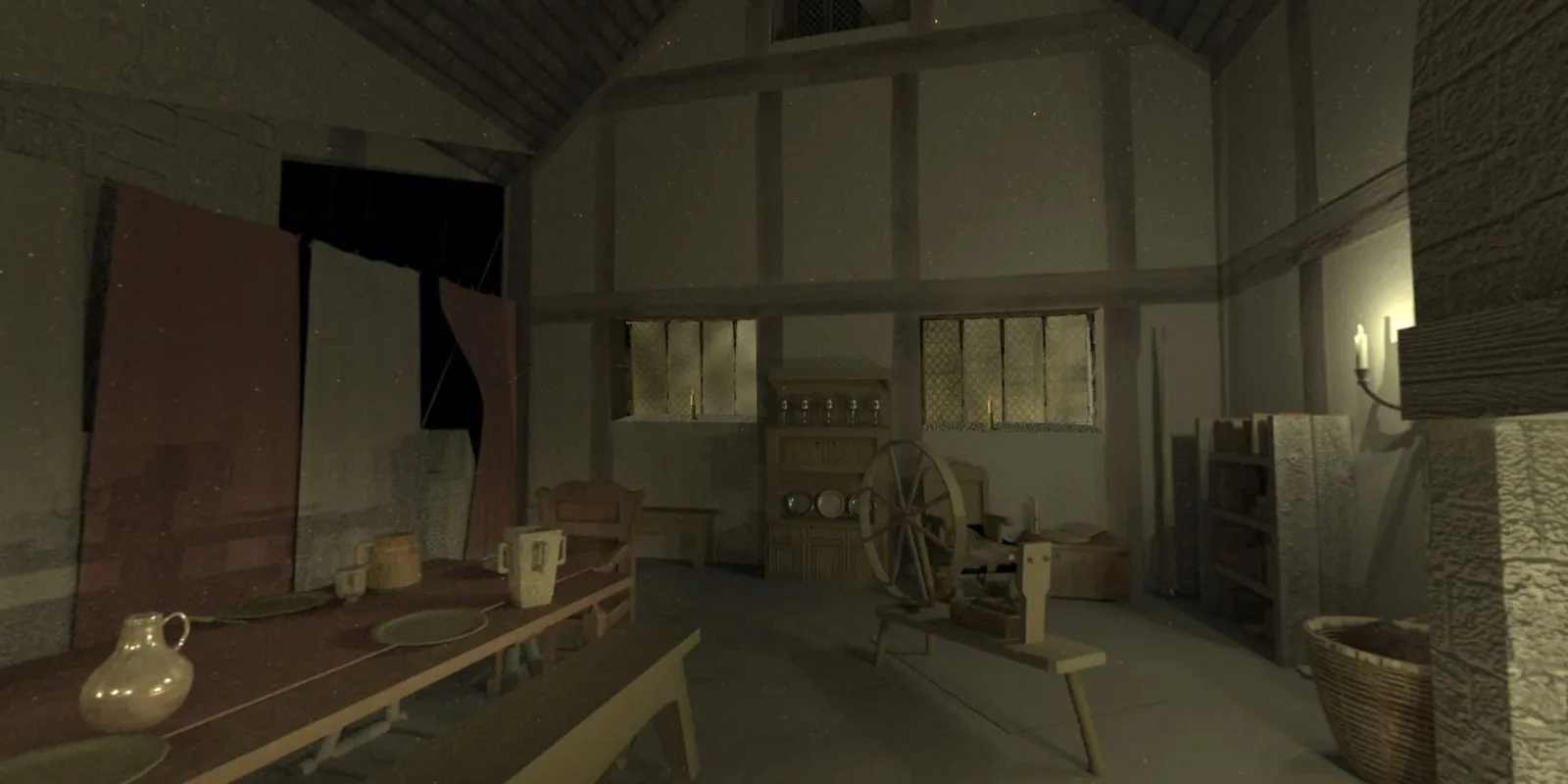
A virtual reality model of Kilcolman Castle, the home of the poet Edmund Spenser, funded by the NEH. I helped design a scavenger hunt about his role as a colonizer and created an interactive timeline of his life.
NEH funded
A shared apartment tracker my friend Abbie and I built with Claude for her move to Manhattan, with maps, commute times and a weekly top four.
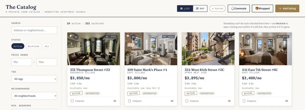
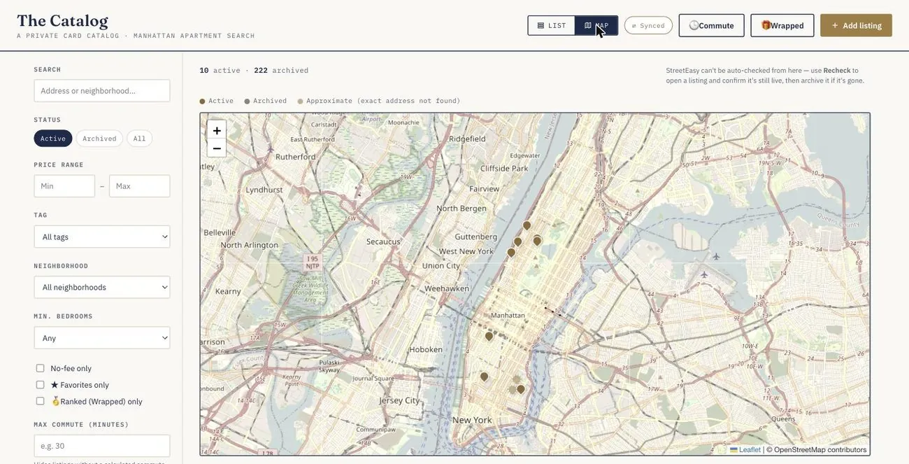
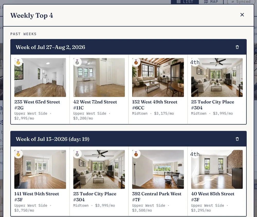
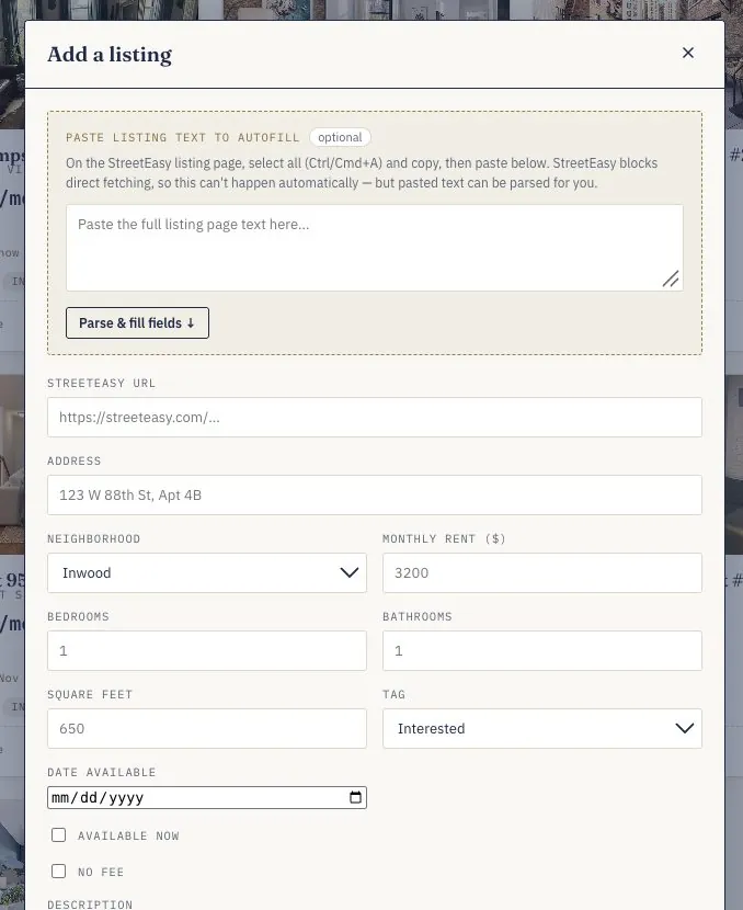
My friend Abbie. Her lease in Hoboken was ending and she was applying to jobs in Manhattan. We tried to search together, but tracking listings across screenshots and spreadsheets was hard to do as a pair.
I described the problem and the needs to Claude and built the app through conversation, testing each version against real listings and reporting what broke. A small Cloudflare Worker syncs our data behind a shared passphrase, so Abbie and I see the same listings on any device.
One of the AI challenges below was a parser that guessed from the whole page. This is a simplified version of both attempts, running on made-up sample text. Edit the text, switch parsers, and see what each one picks.
A dashboard and shared content library that turned 168 game mechanics, scored by eight reviewers on my team at Variant, into a clear next step for each one.
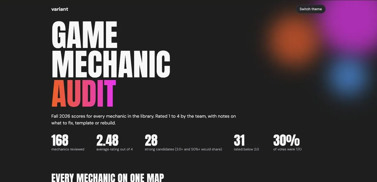
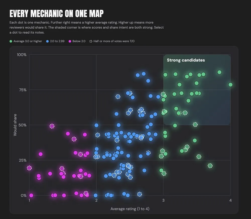
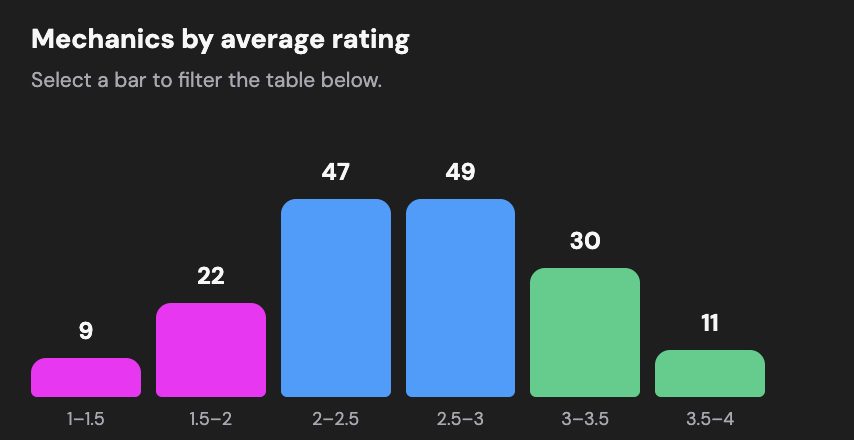
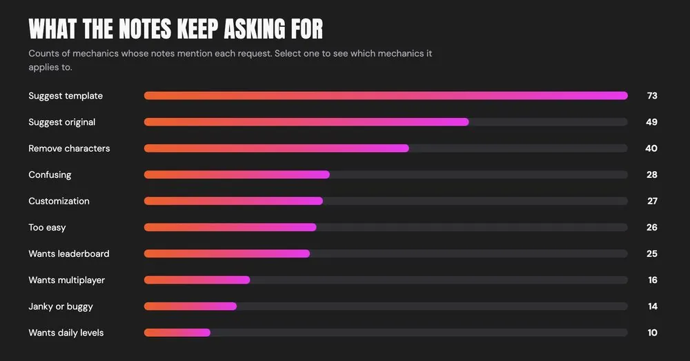
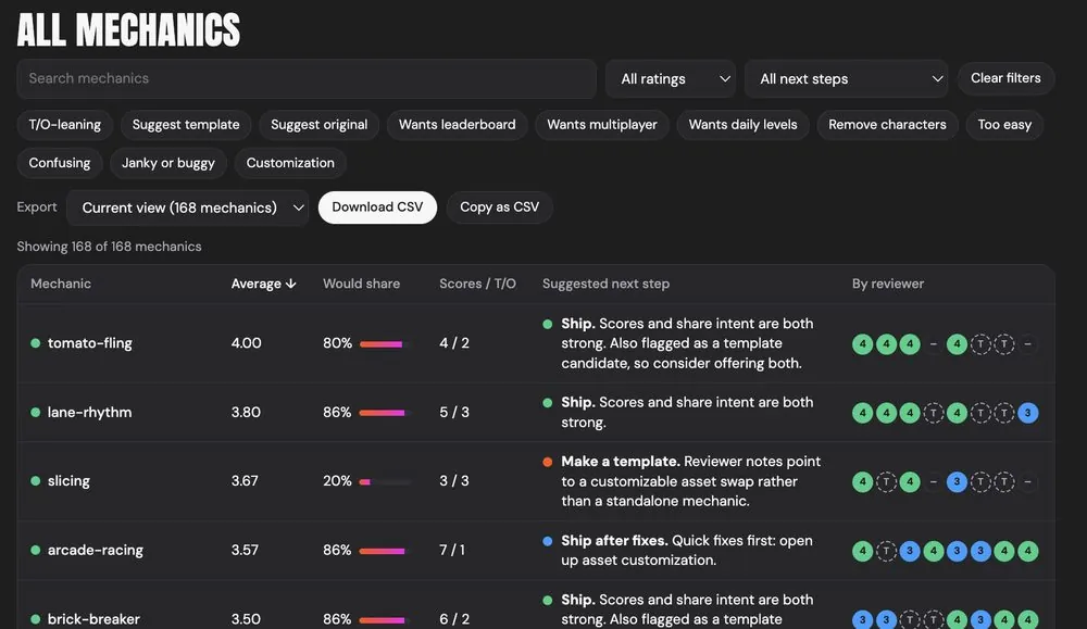
The Variant team. Eight of us had reviewed every candidate game mechanic in a shared Google Sheet, scoring each from 1 to 4, marking template or original, and leaving notes. The sheet was too big to read, and no one could easily see what to do next.
Claude read the sheet through Google Drive and Sheets connectors. Over one long conversation I iterated with it to produce:
January 2023 – Present
Braid is an open-source vocational storytelling community from the University of Michigan. Since 2023 I have worked on one continuous question: how do we form a community around sharing work stories, and make telling them feel joyful? I started as a part-time product designer in grad school and now advise on gamification.
Braid is an open-source vocational storytelling community for students, faculty and practitioners, developed at the University of Michigan, sponsored by the Public Interest Technology University Network and led by Raymar Hampshire. Members share short stories about what they are feeling, thinking and doing in their work.
Braid has no likes, follows, trending topics or influencers. Members react by braiding: adding their own story to someone else’s. Its goals are to make storytelling more accessible, fun and joyful for people from all backgrounds, to strengthen learning and collaboration, and to build supportive vocational communities based on deeper human connection.
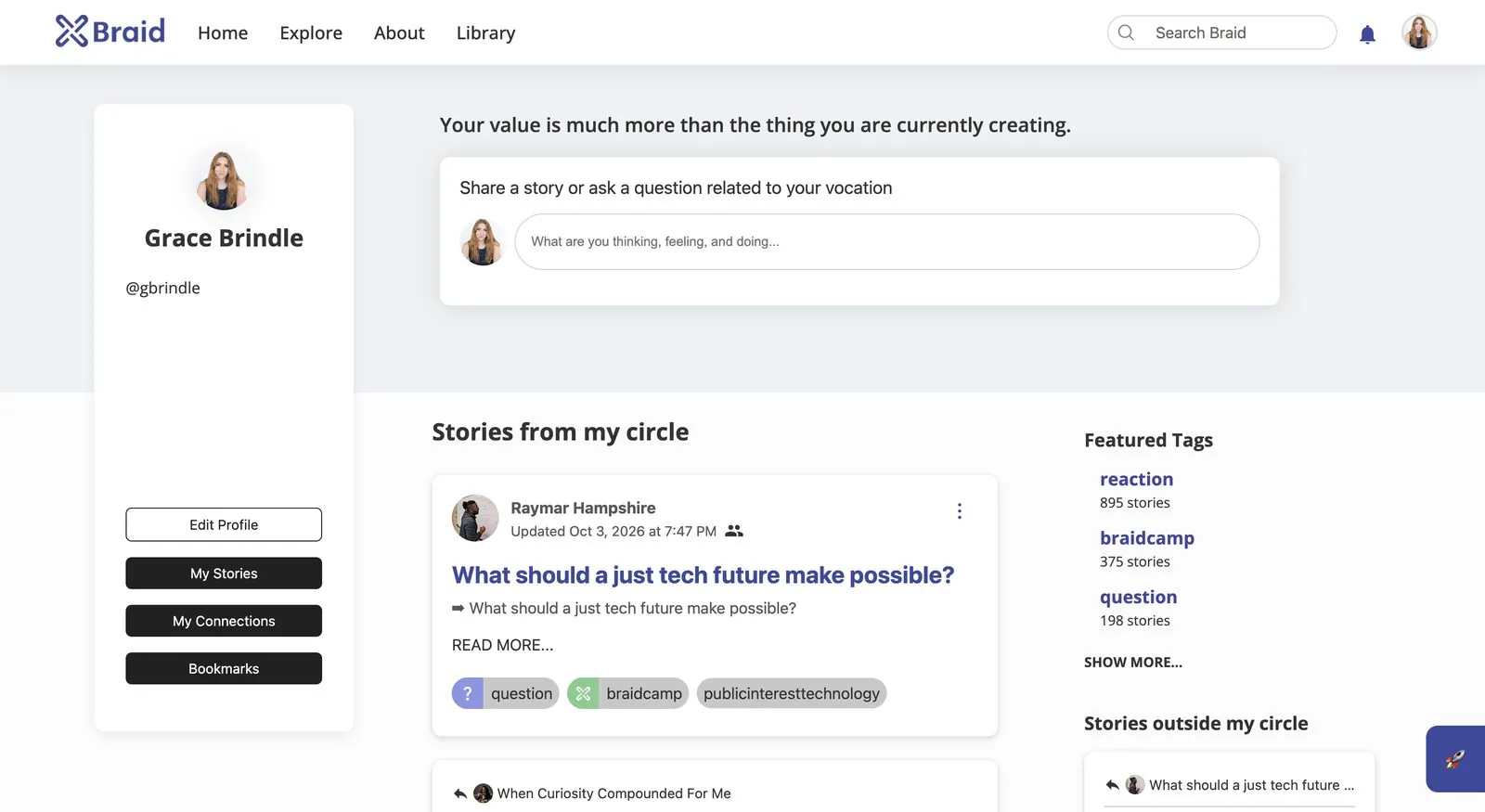
I started at Braid in January 2023 as a part-time product designer while I was in grad school. My focus was gamification, but the work has really been one journey with two threads: helping people form a community, and making storytelling feel easier and more joyful without turning it into a contest. After I graduated, I kept going as an advisor to Raymar.
“Braid Camp” started as the name for the onboarding curriculum I built. New members are not all there for the same reason, so instead of one course I wrote three trailheads, each a path into Braid that matches how someone wants to take part. It was the first step in forming a community: a way in that fits why someone came. Pick a trail on the map key to follow it.
What a story is, why stories matter and what formats they take.
Where you come from, where you are going and what has been hard.
Methods and techniques that make it easier to reflect and share.
How to respond to and build on other people’s stories.
Taking what you learned in camp onto Braid.
The same opening as Storytellers, so everyone shares an idea of what a story is.
Setting intentions and goals, and writing prompts that inspire.
Promoting stories, helping people feel safe to share and building a supportive culture.
Connecting people and linking stories to what is happening in the world.
Taking what you learned in camp onto Braid.
Why UX matters for Braid and its effect on satisfaction and engagement.
Doing research and spotting needs, goals and pain points.
Capturing a user’s perspective and desired outcome, with empathy first.
Summarizing findings so key insights reach the community.
Brainstorming and checking ideas against user needs and platform goals.
Sketching and testing interface ideas.
Presenting well and folding feedback back in.
Treating design as continuous improvement, with a feedback loop for Braid.
Once people are in, the question is how to keep storytelling joyful. As a product designer and advisor to Braid, I explored gamification. The risk was obvious: points and rankings could turn a place for honest stories into a place for performing. So I set out what it should do, and what it should avoid.
Tap any card to flip it.
To test these ideas I built three small playable prototypes with Claude. They explore different answers to the same question: how can taking part feel rewarding without ranking anyone? They are prototypes in Braid’s look and feel, not live Braid features.
Members add a Thinking, Feeling or Doing strand and it becomes a lantern, tent or garden bed in a shared camp. No leaderboards, likes or timers.
Play Braid Camp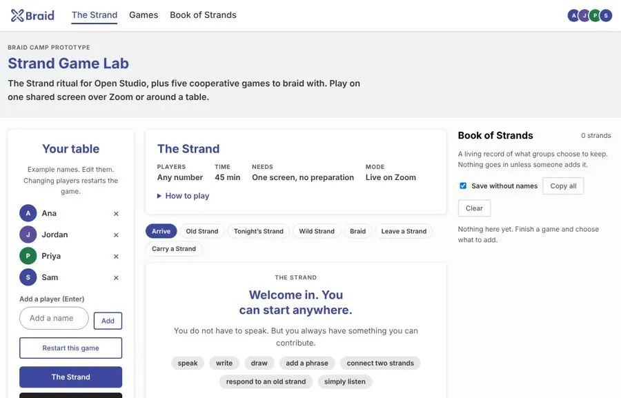
A live ritual plus five cooperative games for one shared screen on Zoom or around a table, with a Book of Strands that keeps only what a group chooses to save. The idea is to use monthly Open Studios as a place to test them.
Open Strand Game Lab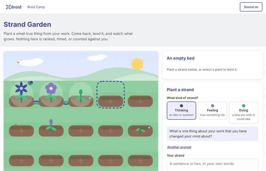
Plant a small true thing from your work, then come back to water it and watch it grow from sprout to bud to bloom. Three kinds in a row grow a braided vine. Plants never wilt and there are no streaks.
Open Strand GardenSince graduating I have kept advising Braid on two threads: building community and making storytelling joyful. Think of the ideas below as signs at a trail fork. Signs pointing left lead toward community, signs pointing right lead toward joy. Tap a sign to see where it leads.
Pick a sign to see where it leads.
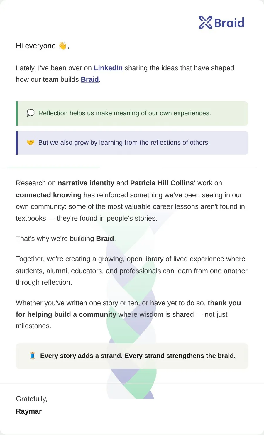
This year I reworked Braid’s email layout with Raymar. The old template put black text over a dark blue and green braid background, so the words were hard to read, and the large braid in the middle pulled attention from the message.
January – April 2023
An educational mobile app for Do1Thing. Do1Thing is a Michigan nonprofit that helps people prepare for emergencies one small step at a time. It was my capstone project (SI 699) for my master’s in human-computer interaction at the University of Michigan School of Information. It won first place for Civic Engagement at the U-M Project Exposition.
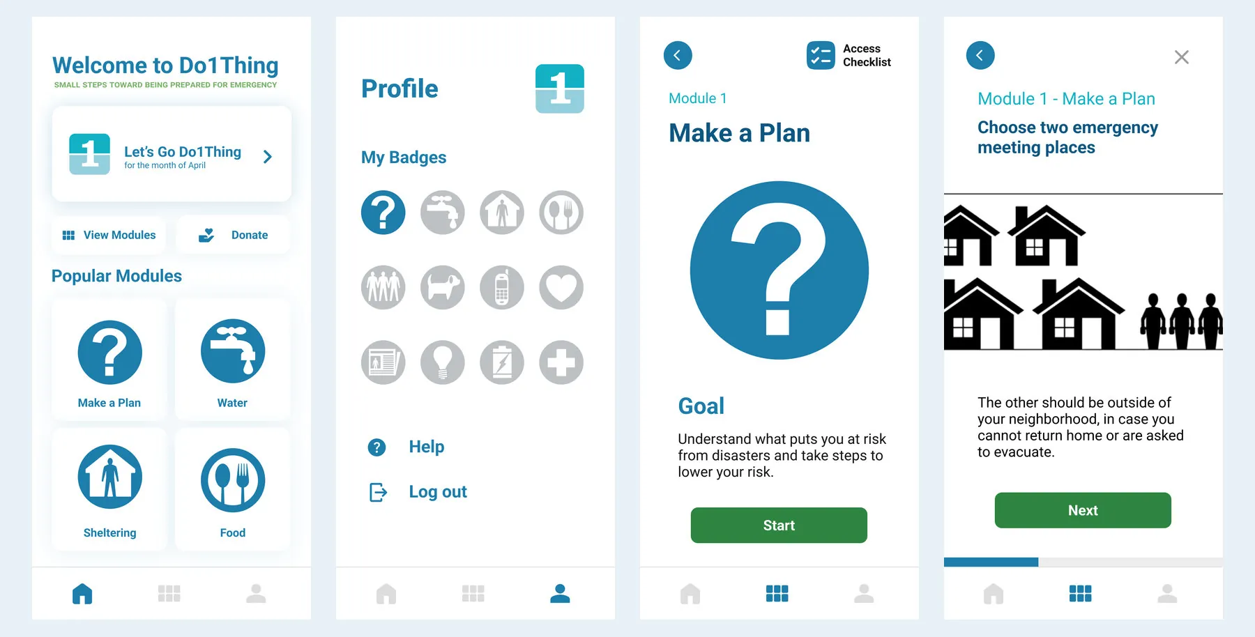
Disasters change things. People who have prepared handle them better. Since 2006 Do1Thing has promoted preparedness with a simple idea: take one small step each month. That way getting ready never feels overwhelming. For years it shared that idea through fact sheets and calendars.
Those formats reach fewer people each year. Younger tech-savvy people expect information to come to them in an app. The project came to our capstone program from the City of Lansing’s emergency management office. The office wanted Do1Thing to reach more people in more ways.
At our January 31 kickoff we came with an agenda and 14 questions. They covered users and success. They also covered features and who would maintain the app. What we heard shaped the project.
By the March midpoint presentation we had done four kinds of research. Each one changed what we built.
Donations support Do1Thing’s work. One of our user stories was donating so the organization could make more content. So the donate button always stays in view. We also found that no similar organization used gamification. That gave Do1Thing a way to stand out.
Use the low-literacy versions of the fact sheets. Choose fonts and colors that people with low vision can read. Make screen readers a priority.
The paper calendar gives each month a topic. People we interviewed said the app should not lock you into following it month by month. They also said what you need to prepare for depends on where you live. Tailoring the app to location became a stretch goal.
Reward actions inside the app with points and badges. Use repeating activities to bring people back.
I scoped the project with the client. Then a team of six of us designed and built the app in React Native and Firebase. It has twelve short modules that follow Do1Thing’s preparedness themes. They run from making a plan to first aid. Each module has a checklist. Finishing one unlocks a badge that is saved to your account in Firebase. The app remembers where you left off. It also has a water calculator and lets you sign in or continue as a guest. Screen-reader labels and image descriptions were built in.
We also built a web dashboard for the people running Do1Thing, so they can see how the app is being used and download the data.
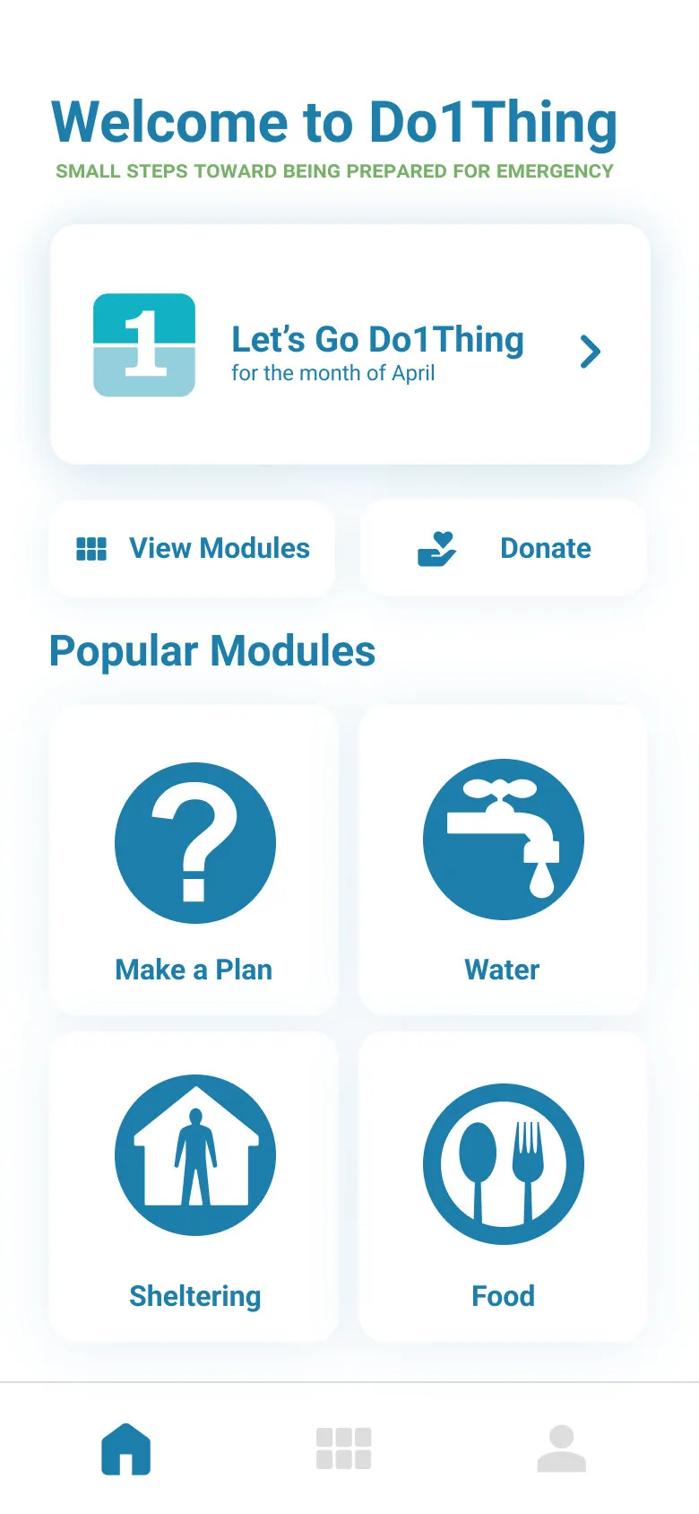
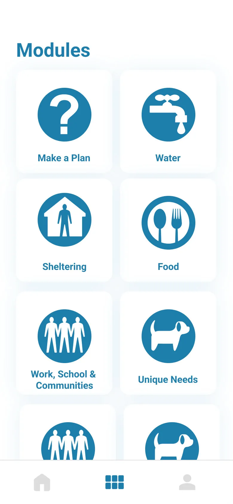
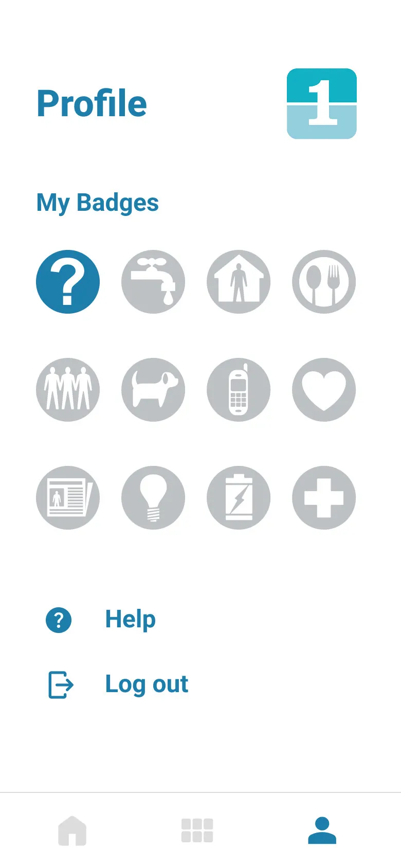
I led the gamification research and design. I also mocked up the database and built the home and profile screens and the badge experience in the app. A teammate designed the look of the app and the prototype in Figma. We used Trello to track the work and React Native and Firebase to build.
Learn
I studied how gamification works and compared four products in the table below. I also pulled out four kinds of players and ten common techniques to choose from.
| Apple Fitness | Duolingo | Kahoot | Freerice | |
|---|---|---|---|---|
| Background | ||||
| Goal | Motivate people to exercise | Help users learn new languages | Help students learn and retain information in the classroom | Donate rice to people in need through trivia questions |
| Target user | Fitness-interested adults | Adults and children interested in languages | Educators and K-12 students | K-12 students |
| Users | Unknown | 9.1 million DAU (2023) | 70 million MAU (2018) | 8 million annual users (2022) |
| Features | ||||
| Goal Setting | Yes | Yes | No | No |
| Levels | No | Yes | No | Yes |
| Badges | Yes | Yes | No | No |
| Points | No | Yes | Yes | Yes |
| Leaderboard | Yes | Yes | Yes | No |
| Competition | Yes | Yes | Yes | No |
| Challenges | Yes | No | No | No |
| Exclusive features | No | No | No | No |
Four products I compared. Green means the product has the feature.
Decide
A themed disaster scenario each month. Players are immersed in it and make decisions as challenges come up. They earn points based on how they do.
Badges for finishing real preparedness tasks. A performance graph shows progress over time and other users can see it. Reminders nudge people to finish tasks.
We built on the second. It fit what Do1Thing already had: a calendar of small monthly tasks. It also fit the reminders the client wanted.
Plan
Do1Thing’s program has three small tasks a month. That makes 36 across the year. I turned that calendar into the game’s tasks. Here are a few of them.
Design
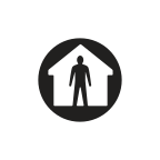
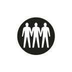
I designed 13 badges. One is for creating an account and one is for making a plan. The other eleven match Do1Thing’s themes. Each badge names what you did. The water badge says “Secured 3 days of water.” In the app the badges follow the twelve modules. The artwork uses open-source icons.









Designed, then deferred
I also designed five levels. The design included streaks and points and a leaderboard among people at your level. It also had stats on your profile. Adding friends was a stretch goal. We built the badges first and left these for later.
Build
I built the home screen. It has a module grid and the current month’s task and the Do1Thing logo. I also built the profile screen. Earned badges show in color and the rest show as locked. I built the pop-up that celebrates a new badge. I also styled guest mode.
Structure
I mocked up the database schema. It covers users and badges and progress through each module and notification tokens. Along the way the design notes answered four questions.
Organize
I made the content management spreadsheet. It lists all 31 fonts and icons and images in the app. For each one it records the file name and the screens that use it. It also records the name the code uses where there was one. That way the team could find every asset.
We worked in sprints with a six-person team and the retros show how the team changed the way it worked.
We took turns being project manager. That way everyone practiced planning a sprint and running the team as well as building.
We ended every sprint with a retro. Everyone rated the sprint out of 10. Then we listed what worked and what to improve. We also listed what we would commit to doing differently next time.
We tracked everything on a Trello Kanban board. It ended with about 90 cards in Done and 26 in the backlog for whoever continued the work. Ten tasks were abandoned. One example was an admin back end for managing content.
At the midpoint we named our own problems.
In the first three sprints we kept saying the same thing. Most of the work landed at the end of the sprint. We should start coding sooner and think through dependencies first.
We committed to all hands on code and reviewing each other’s code. We also held shared work sessions so people could show work midway through a sprint.
By sprint 4 the retro said the work was spread evenly through the sprint. Almost every card was finished. The team rated the sprint 9 out of 10 up from about 7 in the first two.
Preparedness information matters most for the people who have the hardest time getting it. So we spoke with blind and Deaf users while we worked. Two things came out of those conversations. Many Deaf people use English as a second language. A written fact sheet can be hard to follow and sign language versions would help. Several people also told us to talk to the DeafBlind community directly. Their needs would be different again.
On the build side an early demo showed how to do accessibility in React Native. We also wrote guidelines for the team to follow. By the final presentation the accessibility features were about 90% done. Finishing them across the modules was the first item left in the backlog.
A student project ends. So the handoff mattered as much as the build. We wrote a technical guide. It covers how to get the code and build the iOS and Android versions. It also covers how to host the analytics dashboard. In April 2023 I also wrote recommendations for what to do next.
We showed the project at the U-M School of Information Project Exposition, where it took first prize in the Community/Civic Engagement category. The six of us on the team are named in the school’s announcement of the 2023 award recipients. This is the poster we presented.
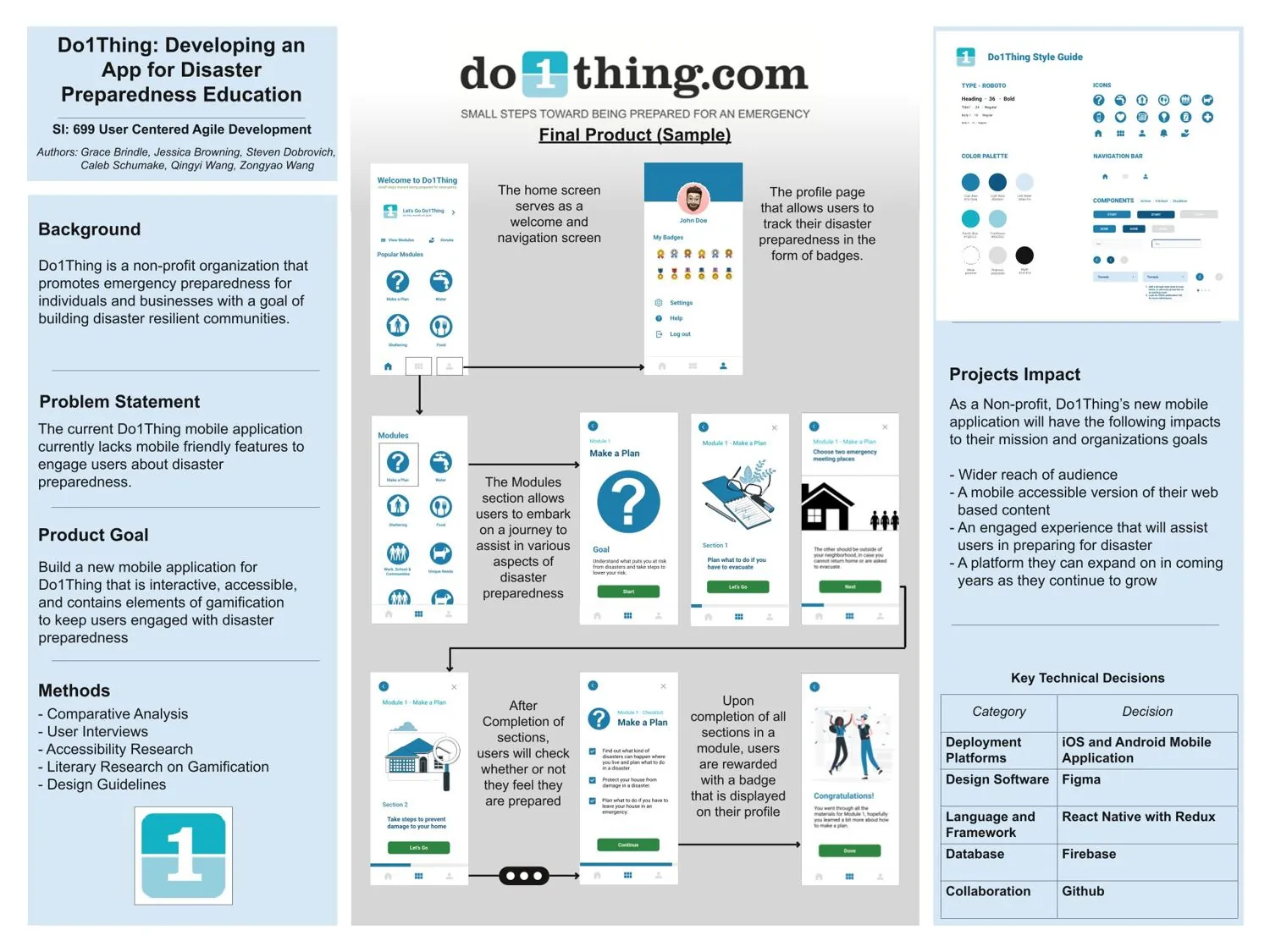
At the final presentation on April 18 we described the app as about 80% functionally complete. The plan was to reach 100% by the handoff.
The app was handed to Do1Thing as working code with a guide to release it. As far as I can tell the organization never published it. The last blocked cards on our board were hosting the app on Google Play and a meeting about the Apple Developer account. Those are the steps between a working build and a public release. We had prepared beta builds for both iOS and Android. So this project won a prize and delivered working code. It stops short of a public launch. What I took from it is how much a handoff decides whether good work gets used.
August 2025 – Present
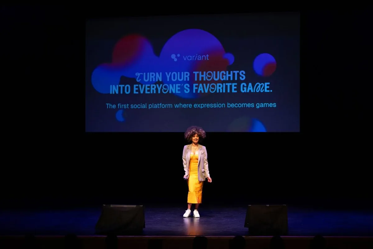
Variant lets anyone turn an idea into a playable game and share it with friends. I joined as the first hire, and together we took it from a concept to a live app on iOS and Android in six months.
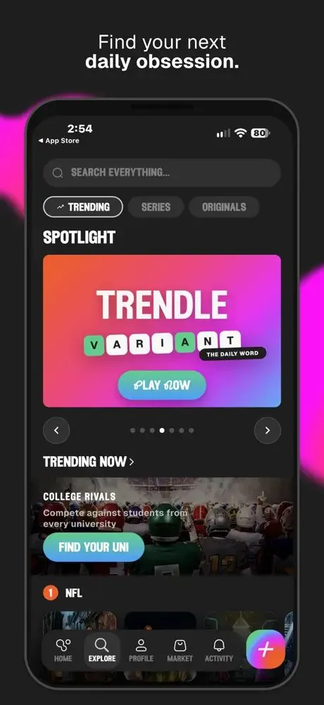
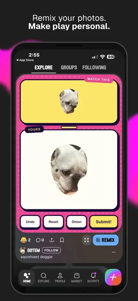
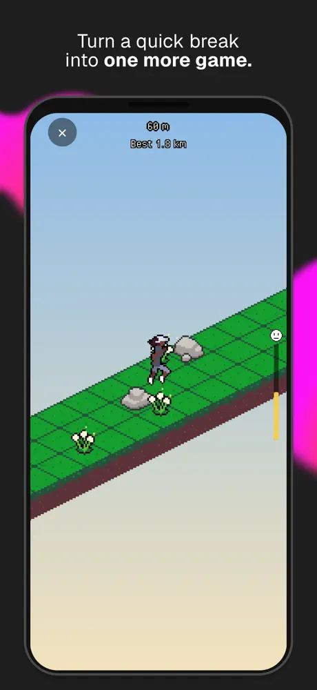
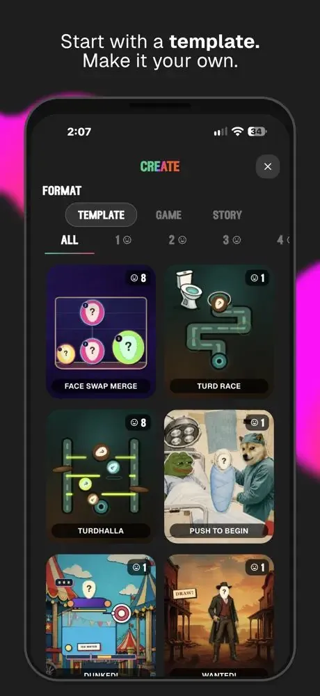
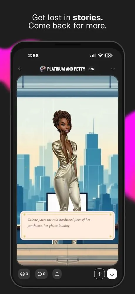
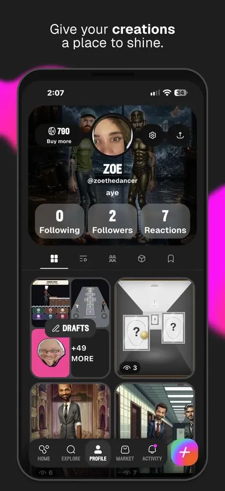
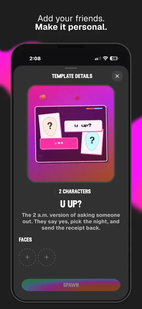
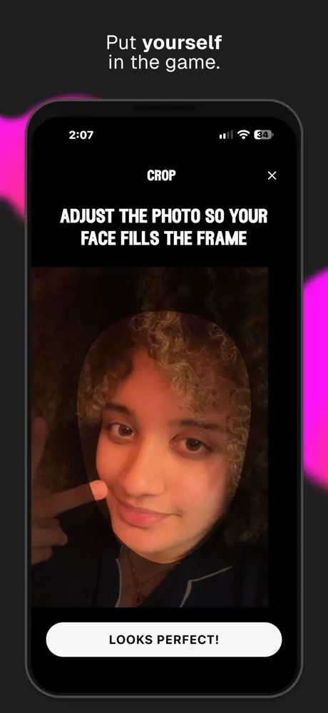
Variant is backed by a16z Speedrun and 2048 Ventures. The idea is easy to say and hard to build: you describe a game, even with no technical skills, and get something playable you can share. My job was to turn that into a product people would actually enjoy using. That meant thinking about how people make a game, how others find it, and what brings both groups back.
I joined part-time as a volunteer in August 2025, when we were accepted into a16z Speedrun, and went full time that October. I was there for Speedrun Demo Day too.
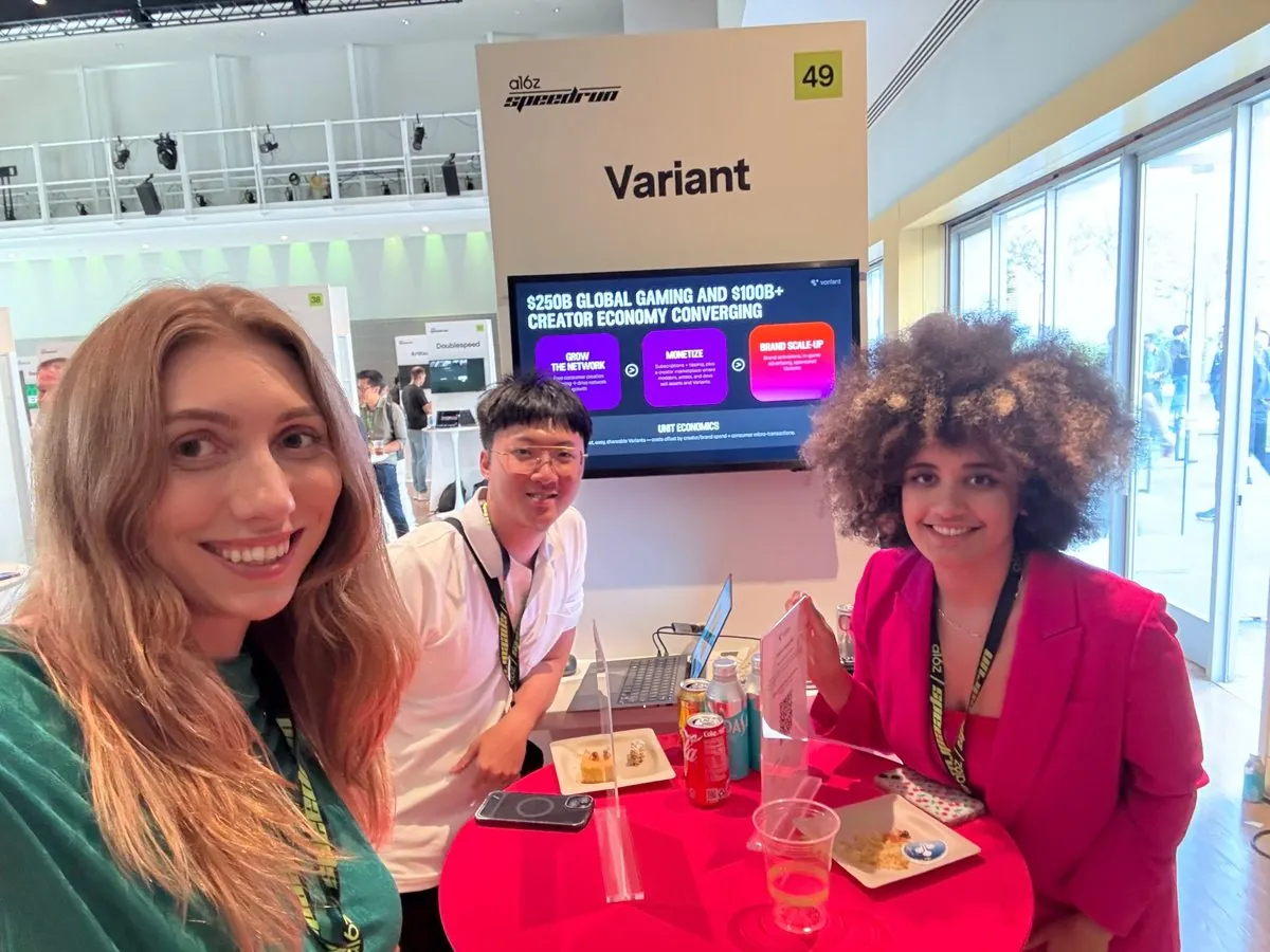
Our core audience is Gen Z and young millennials, roughly 18 to 30, who already make things online: memes, short videos, fan art, small games. Alongside them are people who mostly browse and play, and who might start creating once remixing feels easy. I ran the research to understand what they need, from writing the scripts and recruiting people to sitting in on the sessions and pulling out the themes.
We ran 17 interviews and playtests across those three phases. From the interviews I built four personas and used them to check each feature against real people.

Thrives on collaboration and creative exchange. Sees the internet as a place to build things together, not just consume, and misses the playful, communal feel of early online spaces.
Needs from Variant: Co-creation tools and social feedback loops.
“I love when my friends add to what I made.”
Intentional about her digital life. Values authenticity, thoughtful design and self-expression, and is tired of algorithmic clutter and performance culture.
Needs from Variant: A calm, genuine space where creativity feels intimate.
“It feels more like creating art than chasing likes.”
Curious about technology but wary of over-automation. Values transparency, privacy and control over how AI supports his process.
Needs from Variant: Control and transparency, with strong moderation and privacy.
“I didn’t think I could make something this cool.”

Loves sharing things that make people smile. Hops between TikTok, games and memes chasing humor, energy and quick connection, and drops off fast if things get boring or over-monetized.
Needs from Variant: Instant fun, with as little friction as possible.
“These games are hilarious and quick.”
Personas are composites built from our interviews. Photos are stock images.
I want to feel like the creator.
There is a lot of AI fatigue in this generation, especially around traditional artistic spaces. People wanted to keep agency over the creative process. They welcomed AI as a tool to bring their vision to life, but not as a replacement for brainstorming and coming up with the idea.
What we built: AI that is open about where it is used, easy to turn off, and always alongside manual, hand-built creation.
Let me in fast.
Even small hurdles, like a questionnaire, made interviewees drop an app, and playtesters who were not sure what to do right away lost interest.
What we built: A short onboarding that teaches by playing, so people are making and playing within moments.
Show me myself.
Putting real faces into a story drew the biggest reactions we saw, from laughing out loud to asking to use their own photo in a game. When the characters looked off, though, the spell broke quickly.
What we built: Face upload and a character library, with generation quality and speed as a top priority.
Help me start, but let me skip ahead.
Many people said guided creation asked questions they would never have thought of. Others got impatient once they were ready to play, and an opening question like “what story do you want to tell?” was too open.
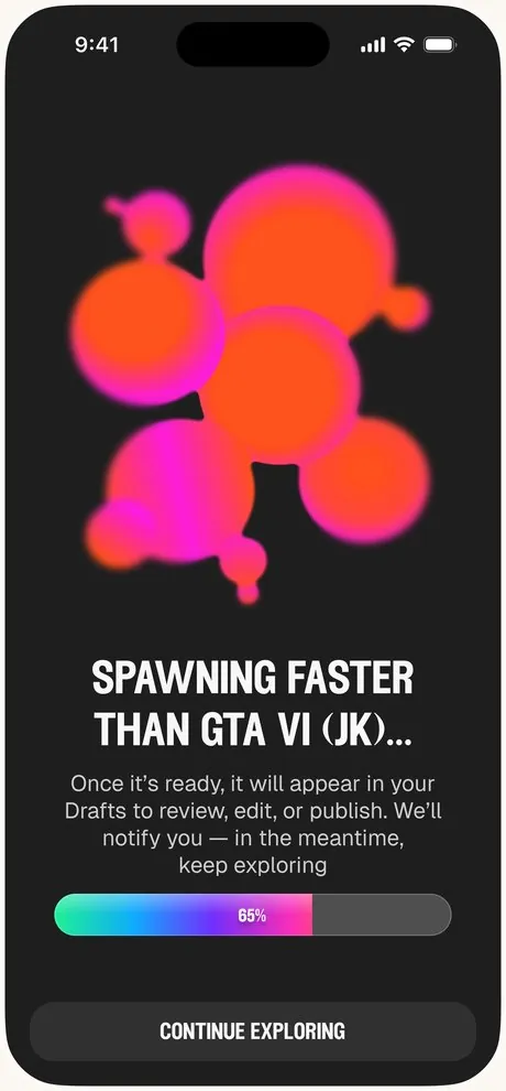
What we built: Structured creation with clear places to start, templates for people who want to skip ahead, and a loading bar so you can see how far along it is.
Areas I designed
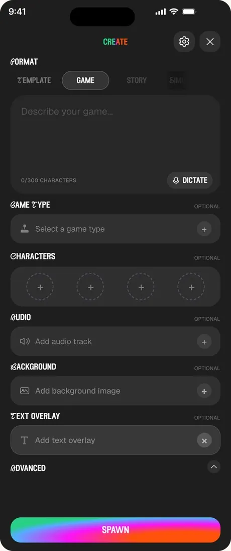
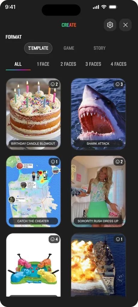
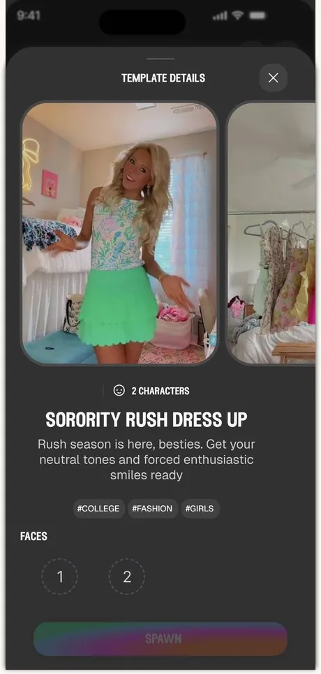
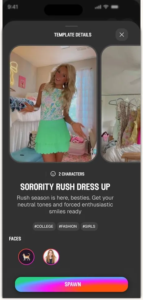
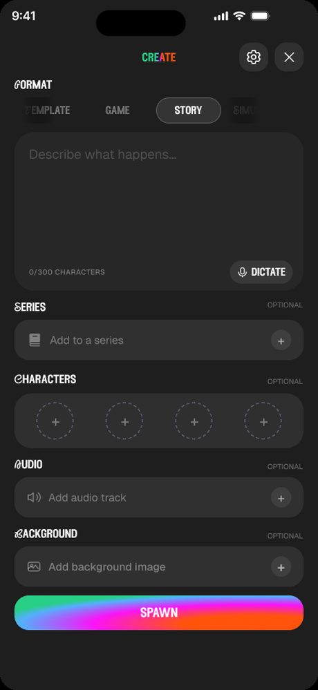
After tonik handed off the first screens, I took over the product design. I made the creation flow more structured, took out the conversational mode, and added templates for people who just wanted to swap faces. Templates became the default.
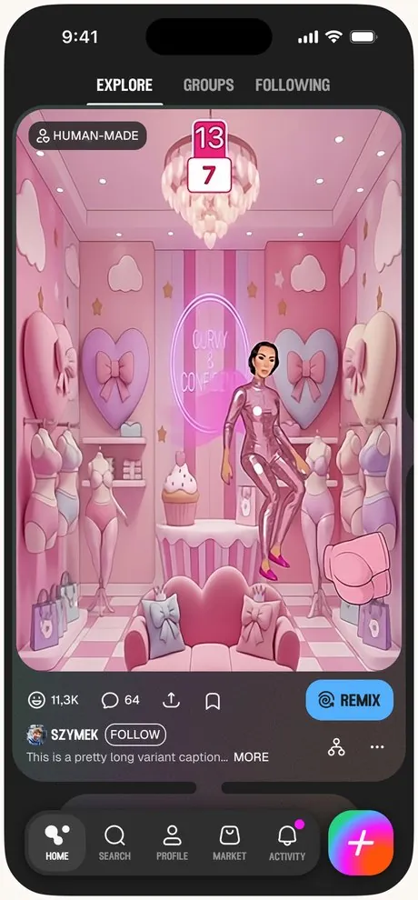
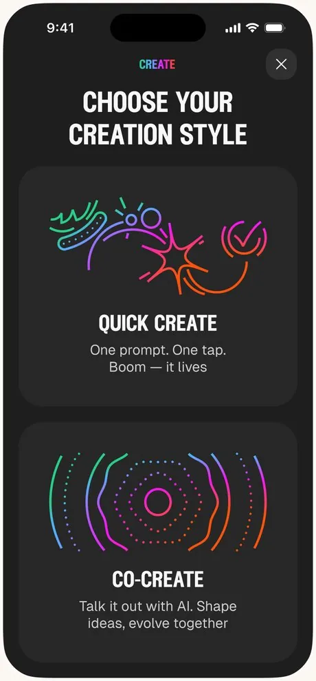
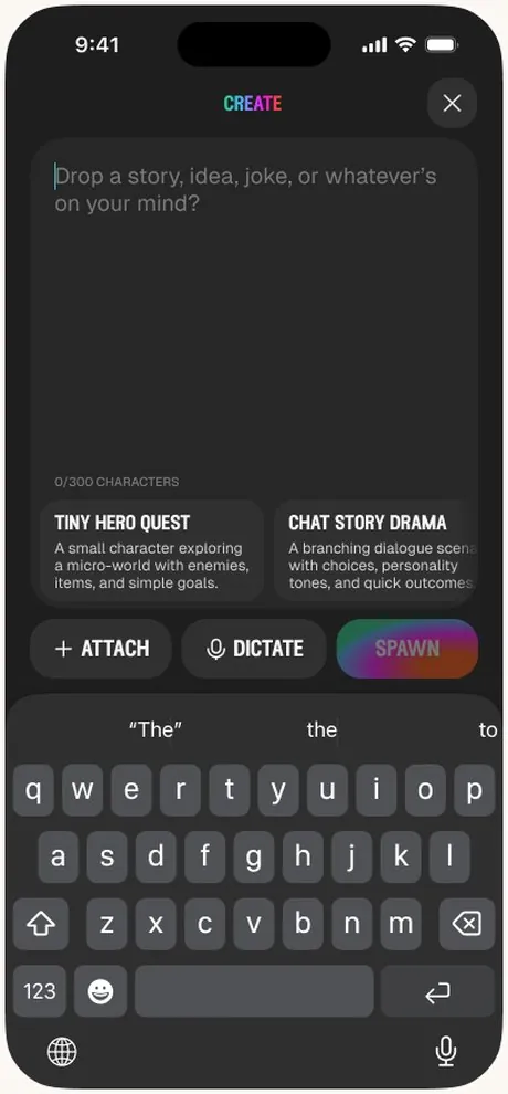
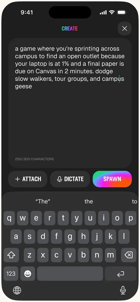
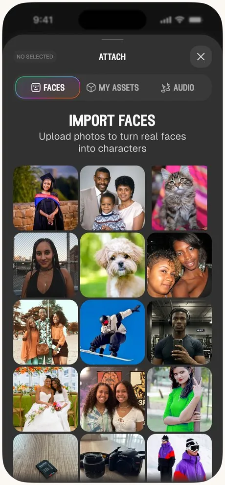
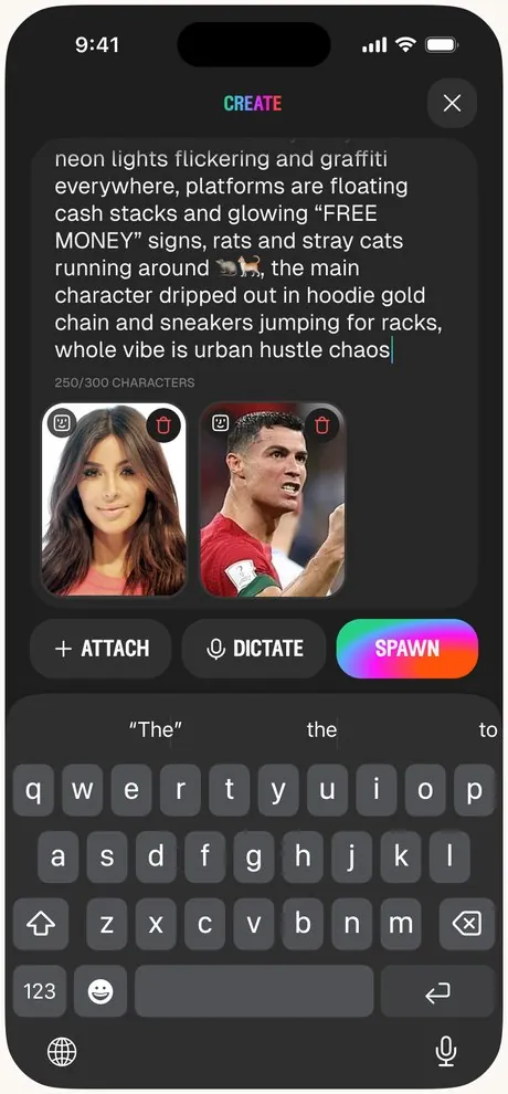
A blank prompt box can feel like a blank page, and a lot of people were intimidated by it. They told us they wanted more structure.
“I really, really struggle with coming up with things on my own.”P1
The new screen gives you clear things to fill in, one step at a time, instead of asking you for everything at once.
People didn’t love feeling like the AI was doing all the work, with no control over what came out.
“I wish I could edit my game from here.”P2
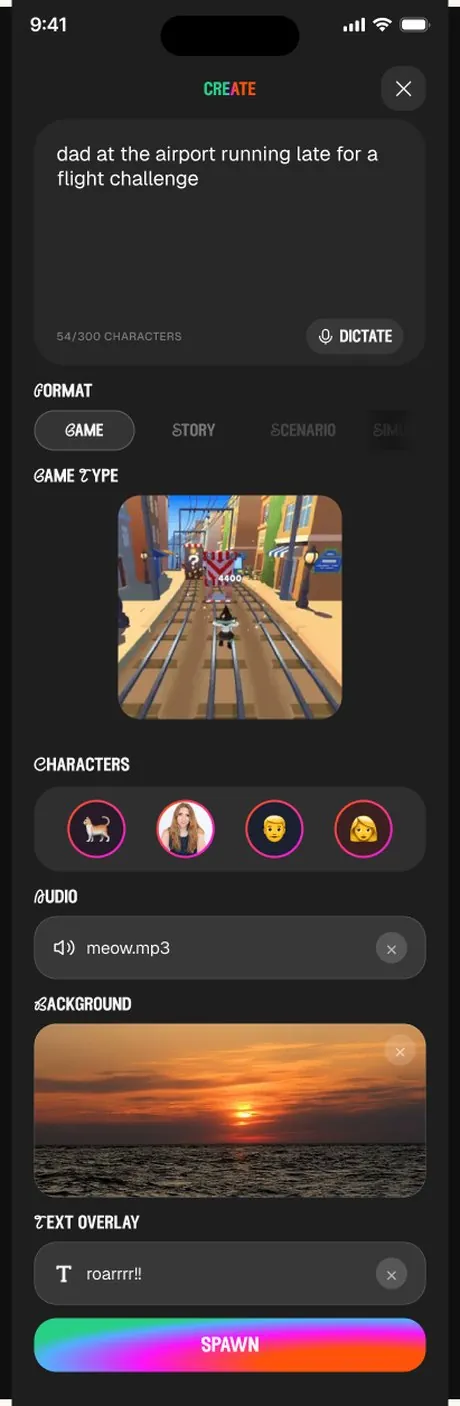
We broke creation into parts, like characters, audio and background. It feels more hand-made because you choose each piece yourself, and it made generation errors less likely.
Our research showed that people were growing tired of engaging with chat bots, and the chat-style mode wasn’t used very often.
“I was just ready to start, and it kept asking me questions.”P4
We took the chat-style mode out.
Most people wanted to see themselves and their friends in a game without dealing with the advanced settings. It was the most popular use case.
“Upload your own picture or something like that if you’re playing it with friends. That could be funny.”P5
Template became the default. Templates skip the AI generation step and use the face you upload as it is, so they suit people who are wary of AI and are cheaper and faster to make.
Smaller additions
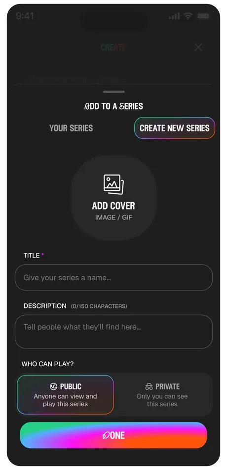
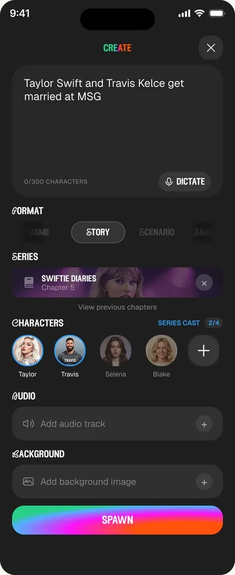
Series let people string stories together into a sequence, so a story can keep going across chapters instead of being a one-off.
People can save their characters and reuse them, so they don’t have to upload the same faces every time they make something new.
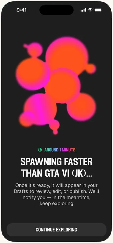
Generating takes a little while and people wanted to know where they were in the process. A loading bar shows how far along it is and roughly how much longer it will take.
“Do we know how long it’s going to take?”P4
Variant taught me what it takes to build a product from nothing, and a few things I would do differently with a second try.
We grew faster than the product needed.
We added people quickly, and I think a smaller, more agile team would have helped us move faster and stay closer together.
Next time: I would stay lean for longer and add people only when a clear need appears.
The product tried to do a lot.
We built many features at once. Our research showed that face swap got the strongest reactions, and it could have been the heart of the product.
Next time: I would start with a focused MVP built around face swap, and add only the features that earn their place.
We joined the accelerator before we had a prototype.
Speedrun is intense and moves quickly, and we went through it before we had something working to test and show.
Next time: I would arrive with a working prototype, so the program can be spent learning from real users.
Building a team fast takes deliberate care.
As the team grew, it took real effort to keep everyone aligned and to make sure each new person was set up to do their best work.
Next time: I would put structure around communication and onboarding early, share context openly, and check in often on how the team is doing.
August 2023 – October 2025
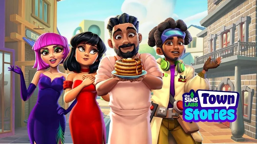
I joined Electronic Arts as a senior product manager on The Sims Labs: Town Stories, a mobile game that brought The Sims together with the cozy, satisfying mechanics of the best mobile simulation games. I was the 13th person to join a team of about 30, and I moved on in October 2025.
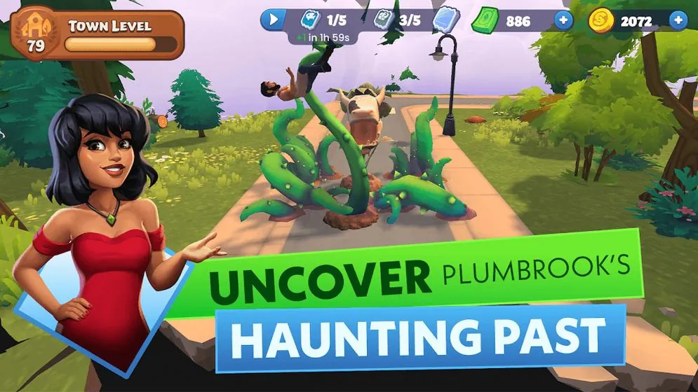
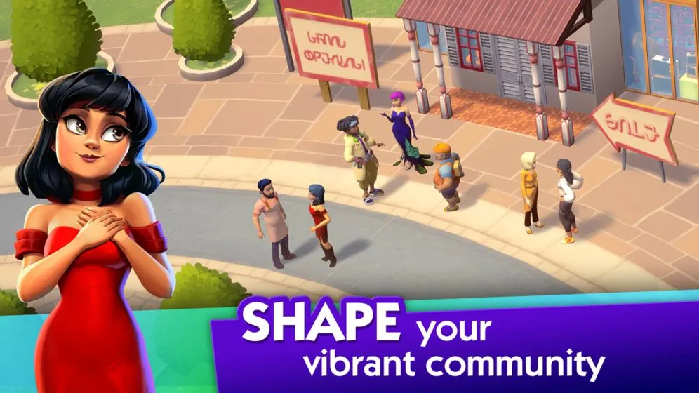
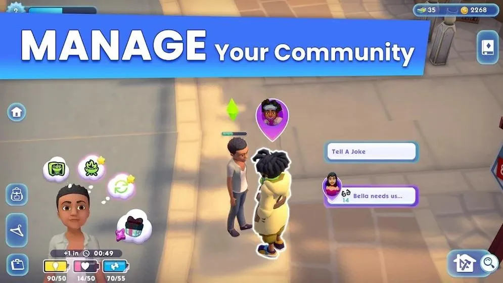
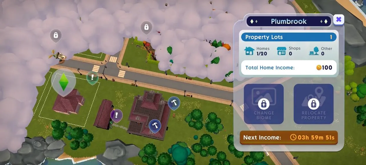
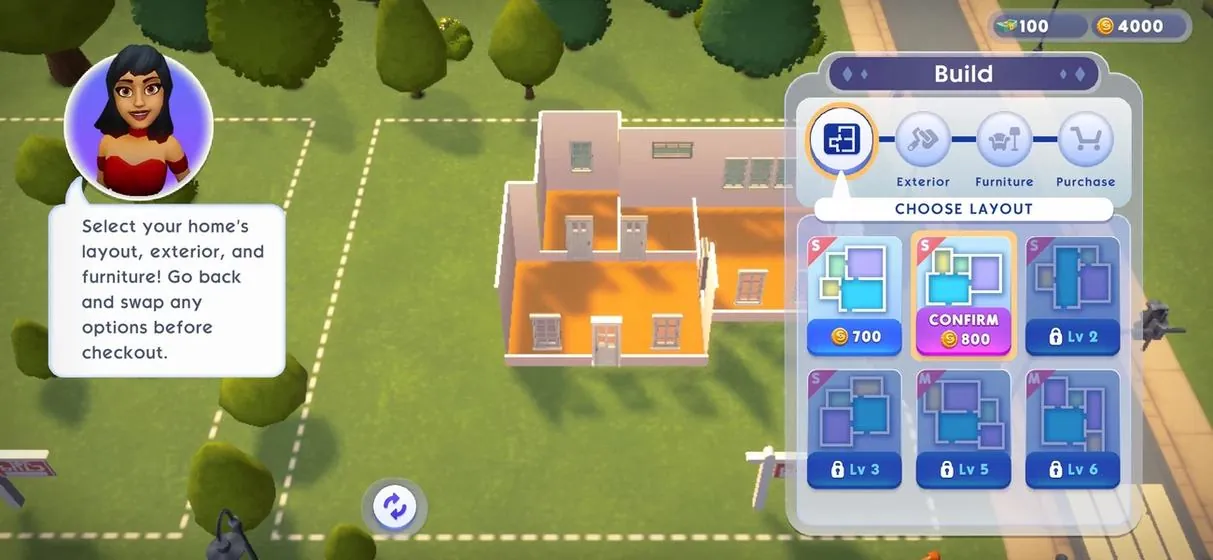
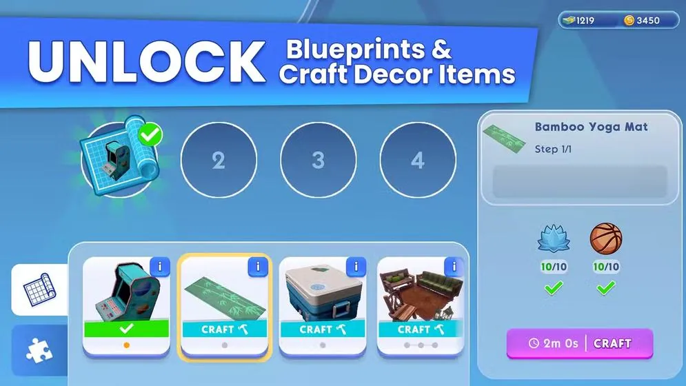
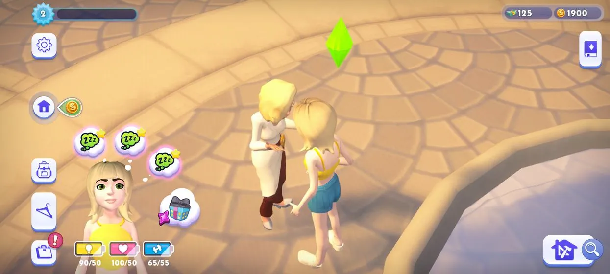
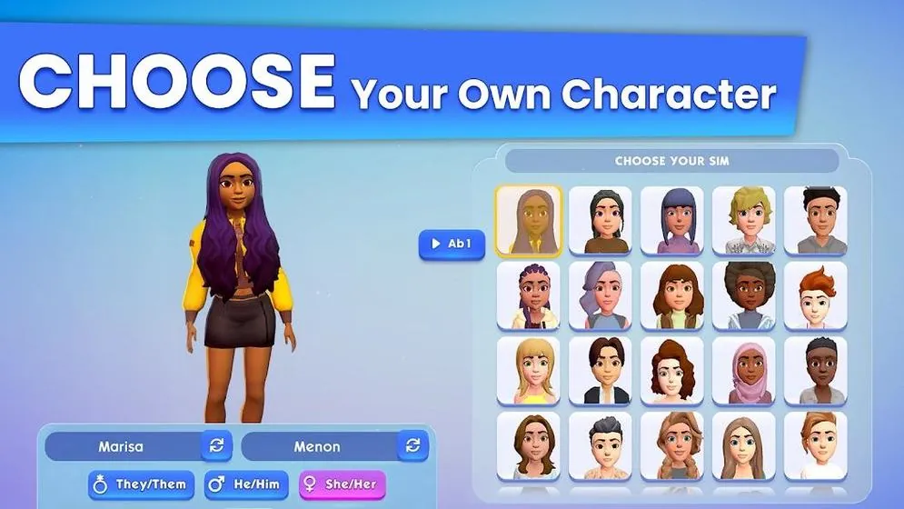
Screenshots and key art are from the game’s public store listings and trailer. © Electronic Arts.
We wanted to bring The Sims to a whole new kind of player, by pairing a franchise people adore with the cozy, satisfying loops of games like Family Island, Township and Merge Mansion.
A new game in a long-running series has to earn its place, so every two months we put a fresh version in front of real players and listened to what they told us.
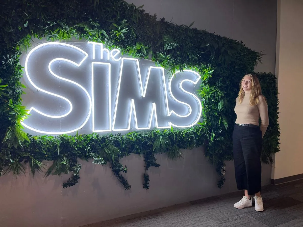
I designed this research approach and ran it with five groups of outside players. The roadmap changes that came out of it led to a 28% lift in D1 retention.
The game was canceled in early 2026. Looking back, two things taught me the most: why the product struggled, and why Create-A-Sim ran late.
Our research described other players, not ours.
Our early research borrowed from Sims 4 and Sims FreePlay. It taught us a lot about those players, but not about the new audience we hoped to reach.
Next time: I would test with the audience we actually want, early.
We never quite decided what this game was.
Were we making a Sims game, or a mobile game in a Sims skin? We never quite settled it, or how we would stand apart from everything else out there.
Next time: I would push for a clear answer on audience and identity early, and treat a missing one as a real risk.
I wrote a very detailed spec (30+ pages!) and a detailed content plan, and we held a kickoff. Unfortunately, I discovered that not everyone had read it very closely.
Next time: Check early that each team has worked through its part and left feedback and comments on the spec, so we can spend kickoff on the questions that need more clarification.
Tech art and engineering each thought certain tasks belonged to the other, and some dependencies only came up late. To get everyone on the same page, I started a daily standup for the feature so we could all see what everyone else was working on. It brought a lot more transparency into the work.
Next time: Start the standup on day one, map dependencies at kickoff, and give every handoff a single owner.
The estimates kept slipping, and in the end we had to push the feature’s deadline back by about a month.
Next time: Track how estimates are drifting every week, so a slip shows up early instead of at the deadline.
Even with the extra month, we still had to cut some things that should have made it in, and the release went out with more bugs than I would have liked.
Next time: Decide what to cut early and on purpose, instead of late and under pressure.
Footage from our Android market tests in Australia and the Philippines, recorded by a player (buzzrot on YouTube). Game footage © Electronic Arts.
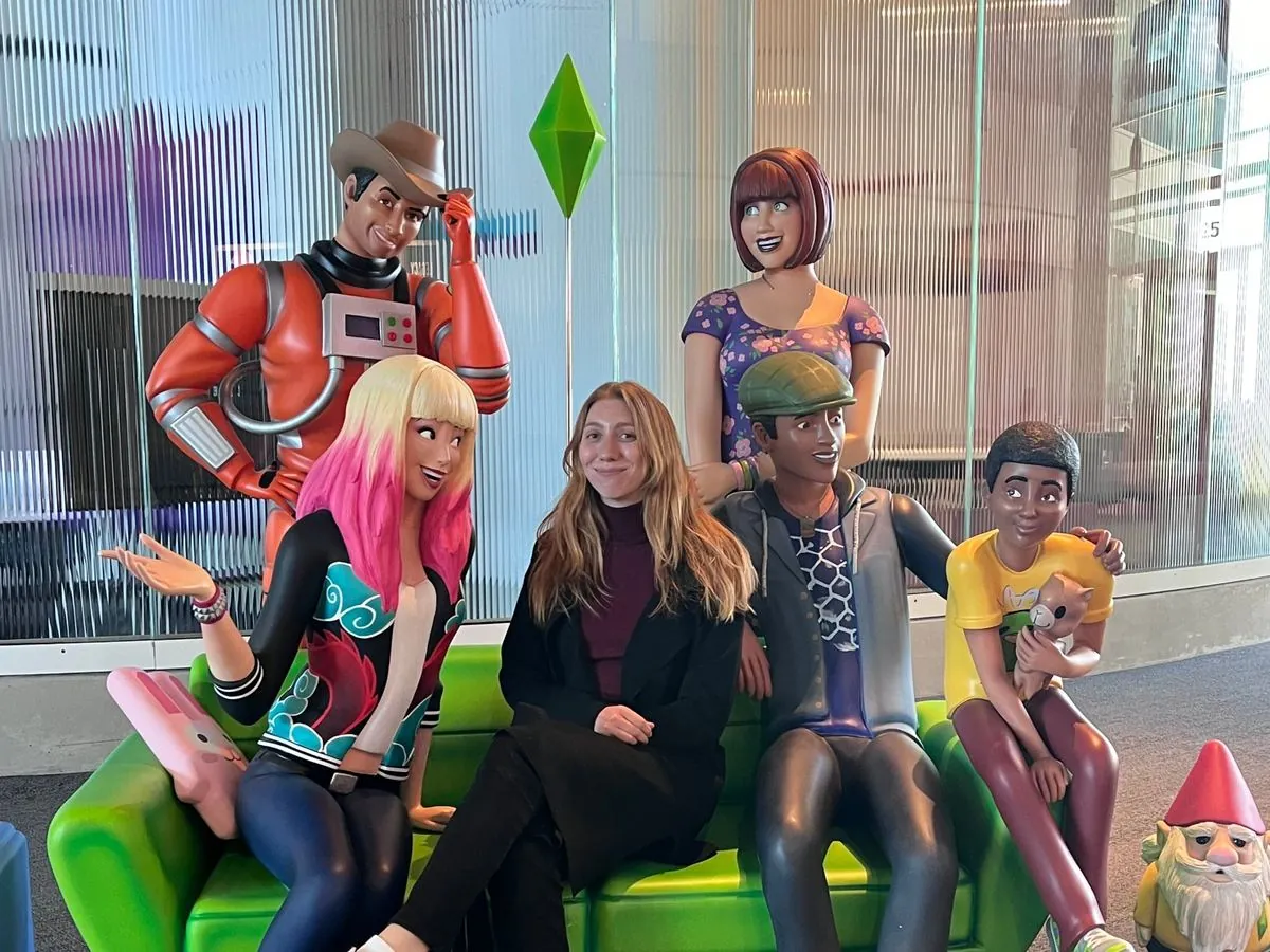
I also got to work on Covet Fashion, a ten-year-old game with 250K daily active users.
September – December 2022
I was the producer, design lead and project lead for the WolverineSoft team that added online multiplayer to Ragnarök TD, a game built the year before. I ran the project, led the design team and worked with the lead engineer to ship it on schedule.
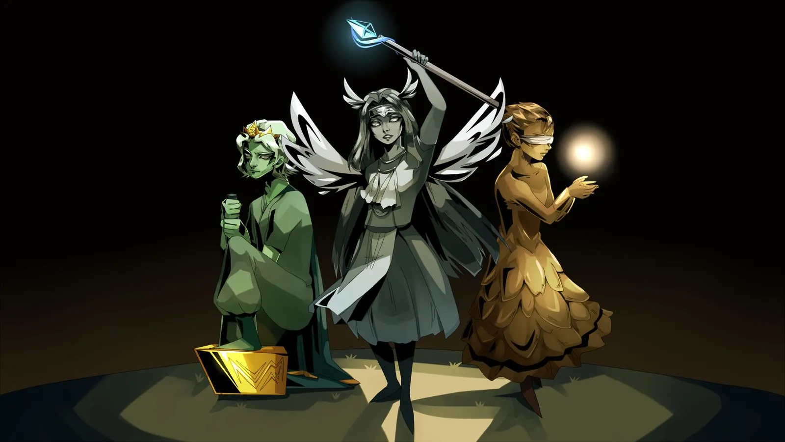
In Ragnarök TD, a small village in the North defends itself against the beasts of Ragnarök. The base game had been designed and built by the previous year’s team. Our job was multiplayer: using the Steam API to turn a game you play alone into one you play with a friend, and releasing it on Steam.
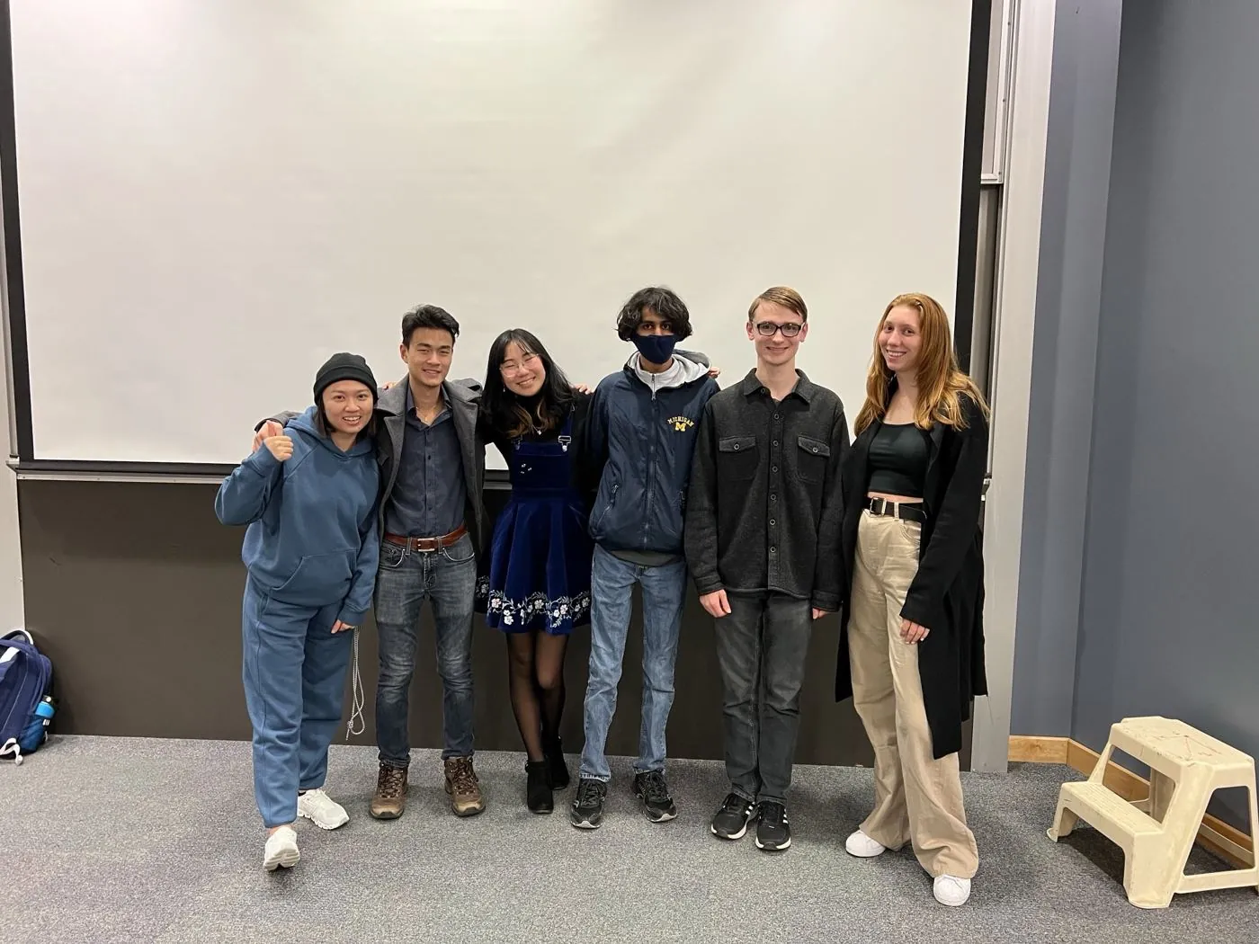
Everyone was a student volunteer who was also taking classes.
September to December, ending in a Steam release.
The base game came from the previous year’s team, and none of them were still around.
I was the producer, the design lead and the project lead all at once. The team had a design department and a programming department. I led design and the project as a whole, and I partnered with the lead engineer to bring it to life.
Met separately with the lead engineer to plan the timeline, scope and work for each sprint. I wrote the tickets in Jira and we assigned them together.
Led the design team, who wrote the feature specs and owned their features through to launch.
Ran sprint planning, review and retrospective. Set up pairings between designers and programmers, and made sure there was time for them to talk.
We used agile with three-week sprints and a shorter two-week final sprint. The whole team met every Sunday for several hours for planning, review and retrospective, and everything else lived in Jira and Confluence.
That was our codename. I opened the semester with a kickoff deck that set five goals.
Everyone installed Unity, got the code running, learned Confluence, and played Ragnarök TD and Bloons multiplayer.
The goal was high-level design documentation in Confluence, so programming had a reference to build from. We started with a competitive analysis of Bloons, Among Us, Civ V, Minecraft and Apex Legends, to see how each handled multiplayer.
Design goalsA shorter, two-week sprint, the last before release. We shifted from building to testing and finishing.
GoalsShipped on schedule
Tap a sprint to see the goals.
How the weeks worked
A sprint was three weeks. Each designer was paired with one or two programmers in a pod and owned their feature. The designer answered questions, guided the programmers and reworked the design from what came back.
Tap an event on the calendar to see what it was.
The first Sunday of each sprint, with the whole team together for several hours. We planned the sprint: the lead engineer and I worked out the scope and work, and I wrote the tickets in Jira and we assigned them together. The session ended with action items assigned by name in our Confluence notes.
The whole team met every Sunday for several hours. Our Confluence notes followed one agenda: retrospective, how the last Sunday went, then a status check-in from programming and from design, ending with action items assigned by name.
Pod meetings happened here too. After the design presentations, programmers picked the design documents they wanted to work on, two programmers per document, based on interest. Each designer then met with their programmers (two and two, or two and one) for about 20 minutes to make an implementation plan together. A programmer took notes straight into the design document on Confluence, and we listed what programming needed to research and what design needed to refine. We also went through the FAQ, writing each answer directly under its question and never deleting a question.
A weekly Thursday-night session, 6 to 8pm, in a study room I reserved at school. The design team showed up. The programmers didn’t, which is a big reason the Sunday session mattered: it was the one time everyone was in the same place.
Usually during coworking night. Designers presented their documentation to one another and reviewed each other’s specs in a rotation, including mine. Then they edited, and moved on to low-fidelity visuals.
Held on day 22, the Sunday at the end of a three-week sprint. Designers presented their documentation and mockups, with about ten minutes to present. Programmers gave feedback right after, or left comments directly in the docs. We asked programmers to read the documentation beforehand, knowing they would get a more detailed presentation and that there was still another sprint to refine the docs.
Programmers presented their technical work too: a live demo, with each system toggleable so people could see which part was theirs, and brief slides, often diagrams rather than full decks. I asked everyone to be kind, not to turn it into a roast, and to explain things in terms a middle schooler could follow, so nobody felt put on the spot.
We collected anonymous feedback on how the sprints were going in a Google form, then talked it through in person. That gave quieter people a way to be heard.
Before anything was built, the designers mapped every screen a player would see, and the decisions behind each one, on a shared FigJam board. The designers behind the match-flow spec, Qingyan Li and Peter Yoo, built the maps. I directed the work and gave feedback along the way. Tap any image to enlarge it.
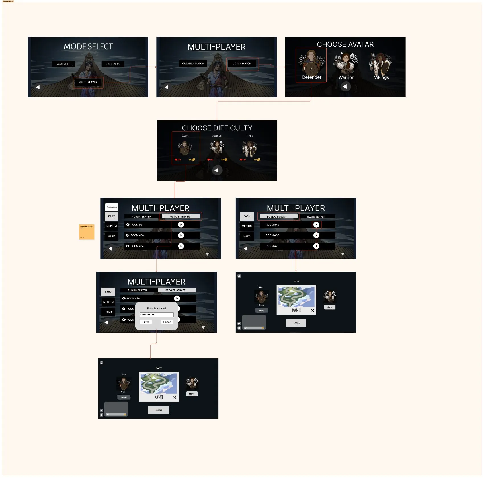
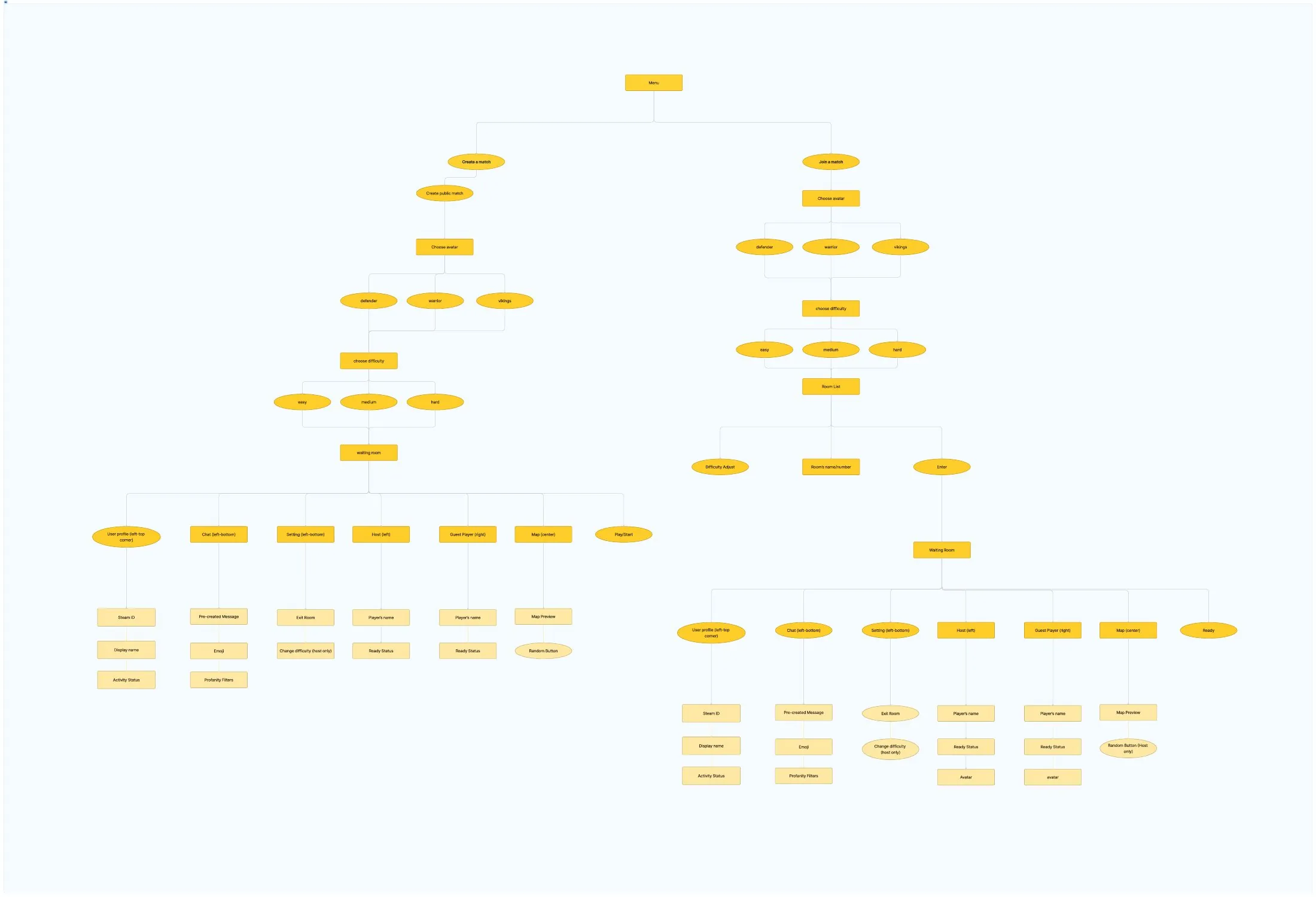
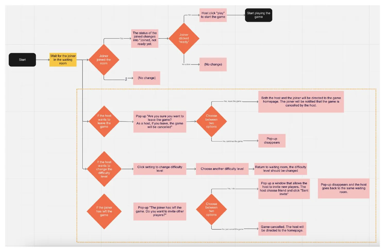
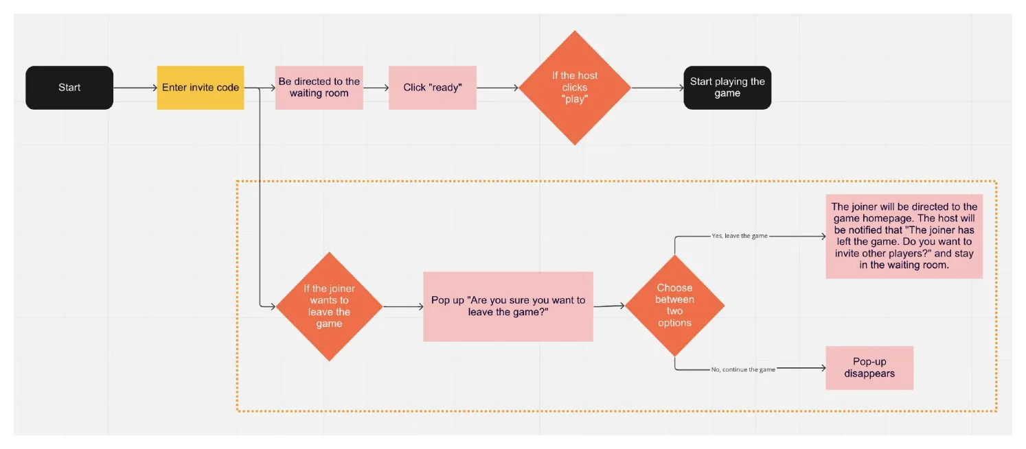
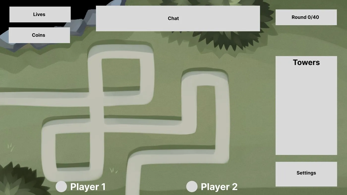
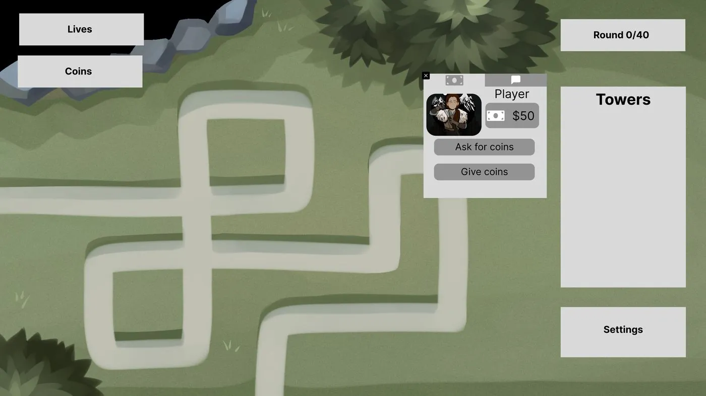
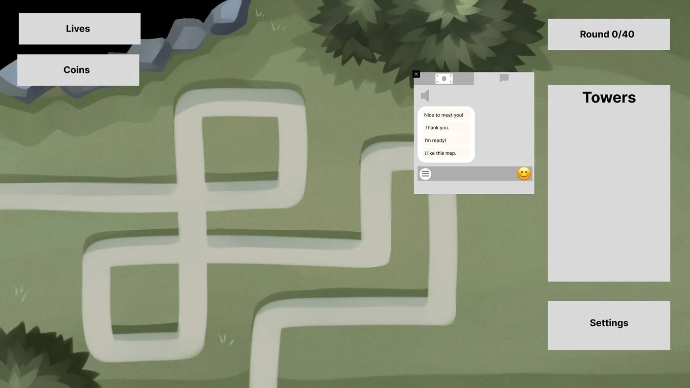
Beyond the menus, I owned the gameplay itself: what a player sees when a match starts, how players send money to each other, and how resources are managed between them. I took on more of a game design role here, and I made these mockups myself. Tap any mockup to enlarge it.
Lives and coins at the top left, the round counter (0 of 40) and a shelf of towers on the right, and a chat bar across the top. Each player gets a marker along the bottom.
Tapping a teammate opens their card, which shows their avatar and how much money they have, with two buttons: Ask for coins and Give coins.
Players talk with a short list of pre-made messages and emoji. The competitive analysis had flagged pre-made messages as a way to prevent harassment.
Fully functional online multiplayer, shipped on schedule.
One multiplayer match, start to finish
A lobby and chat box, plus sending and receiving invitations
The game starts once both players are ready
What happens when a player leaves or loses connection
Ten Steam achievements
I designed the set. Steam requires achievements before a game can go on its store, and they give players a sense of accomplishment.
 BeginnerLaunch the game
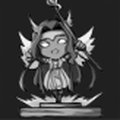 Ragnarok SurvivorBeat the single-player campaign mode
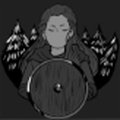 Dawn of GloryBeat Dawn on the highest difficulty
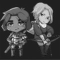 Allied VictoryWin a multiplayer game
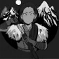 Evening TerrorBeat Evening on the highest difficulty
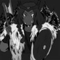 Night KingBeat Night on the highest difficulty
 CommittedPlay 30 days in a row
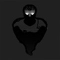 Beast SlayerDestroy 1,000 enemies
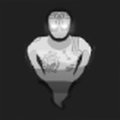 Ultimate WarriorDestroy 10,000 enemies
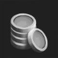 Heavy SpenderSpend $1,000,000
Built collaboration into the schedule instead of hoping for it.
Design and programming tended to work separately, and the programmers were less involved in the time we set aside to collaborate. I couldn’t assign my way out of it, because everyone was a volunteer. So I built the connections into the structure: pairing each designer with programmers, holding pod meetings inside the Sunday session, and opening a Thursday coworking night. Collaboration was better when it was part of the schedule than when it was optional.
Designers learned Git and Unity and built the screens themselves.
Late in the project, we learned that implementing the UI in Unity was design’s job, not engineering’s. We had planned around the opposite. The designers had to learn Git and Unity quickly and build the screens themselves, with programming supporting us. I reworked the sprint goals to put UI implementation on the design team’s list and kept everyone focused on what had to ship.
Learning the studio and leading a project at the same time.
I had just joined the studio and was put in a leadership role right away. I learned how the studio and its people worked at the same time as I led a project, and I was expected to be producer, design lead and project lead all at once. It was a lot of work, and I didn’t feel I had much support.
Nobody from the original team was left, so we learned the game first.
Nobody from the original game’s team was still around. All we had to build on was the previous year’s documentation in Confluence, and it wasn’t very thorough, so the team had to learn the game before they could change it.
A much larger project had the studio’s attention, so structure mattered more.
Most of the studio was working on a different, much larger project, so fewer people and less attention were left for us. That made the structure we set up, with clear sprints, pods and reviews, matter even more.
Fall 2019 – 2021
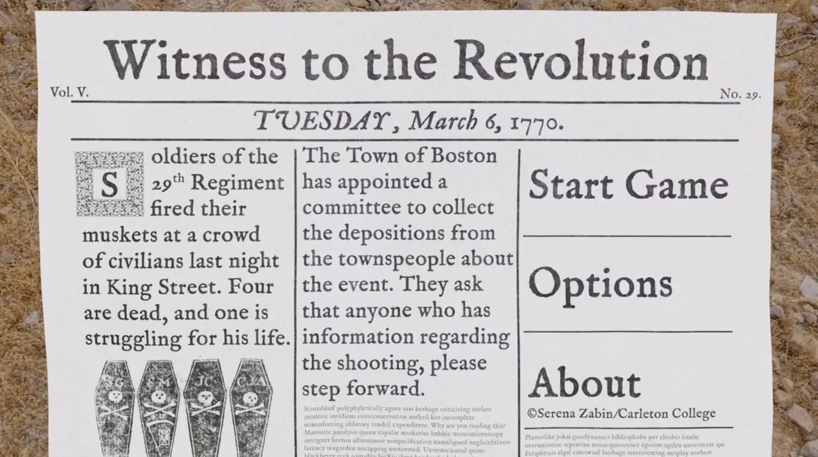
A game set in Colonial Boston, three weeks after the 1770 Boston Massacre. Players look into what happened that night and decide how much to trust what people tell them. I designed and built its player map in Unity as a student in a Carleton course.
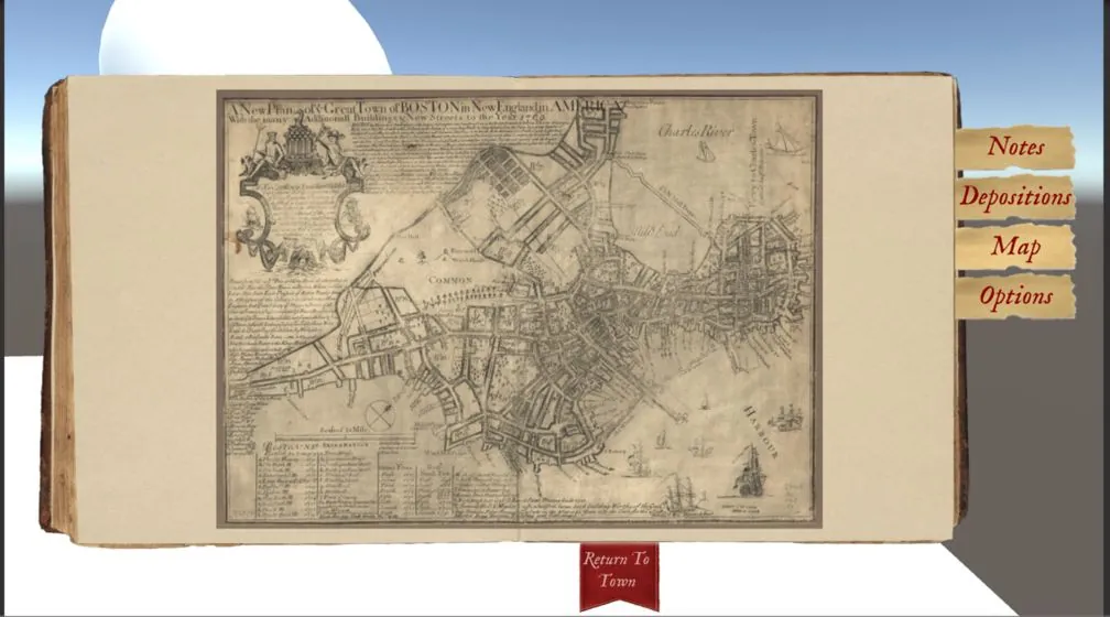
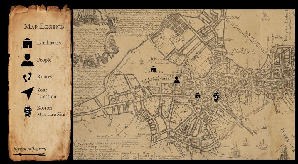
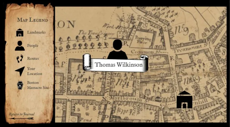
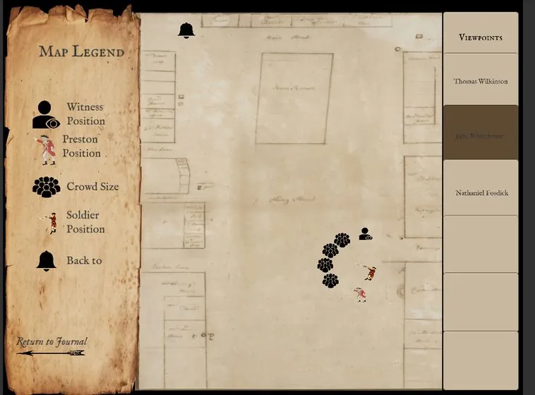
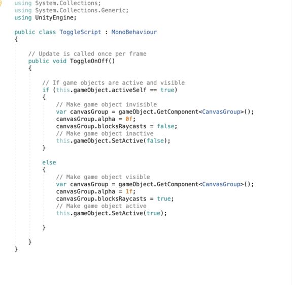
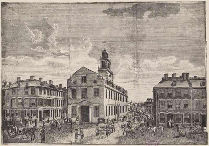
Title screen © Serena Zabin/Carleton College. Other images are from the Witness to the Revolution project.
This game is about how misinformation, deliberate and accidental, shapes the way we understand history. At its heart is one question: what happened on the night of March 5, 1770? Carleton professors Austin Mason and Serena Zabin created it, and students in their Fall 2019 course, The Boston Massacre in 3D: Mapping, Modeling and Serious Gaming, helped build it. I was one of them. Players piece together testimonies ahead of the soldiers’ trial, then decide whether to support the prosecution or the defense. The team has stopped developing the game, and its site keeps the work available.
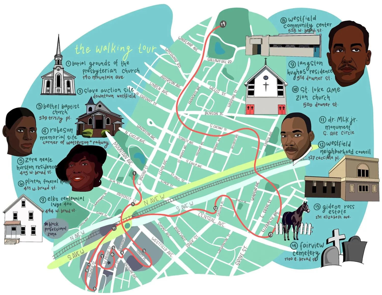
Summer 2020
In 2020, Westfield, New Jersey turned 300. I was a student historian on the committee that researched the town’s African-American history, and I researched, designed and launched the online version of its 14-stop walking tour on Clio. I also chaired the research and production of the tour’s timeline.
The tour follows African-American life in Westfield from the colonial era of enslavement through Reconstruction, Jim Crow and the civil rights era. Along the way you pass burial grounds, churches, a funeral home, a community center, and the former homes of Zora Neale Hurston and Langston Hughes. A companion timeline puts national events next to local ones. The Westfield 300 committee published it as a booklet and as an online tour.
2020 – 2021
A virtual reality model of Kilcolman Castle in Ireland, where the 16th-century poet Edmund Spenser lived, funded by the National Endowment for the Humanities. As a Carleton student I helped design a scavenger hunt inside it, and later, as a research assistant, I created an interactive timeline of Spenser’s life for the project’s website.
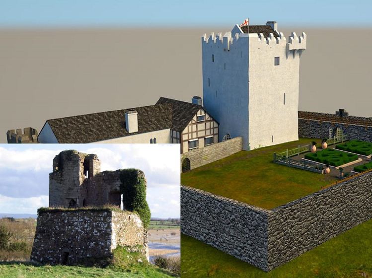
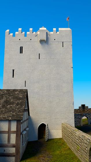
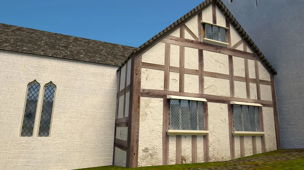
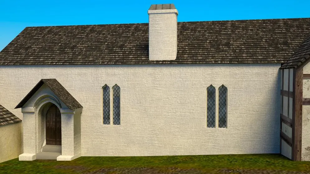
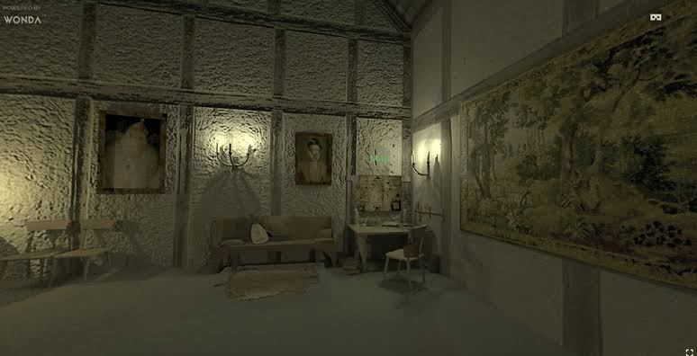
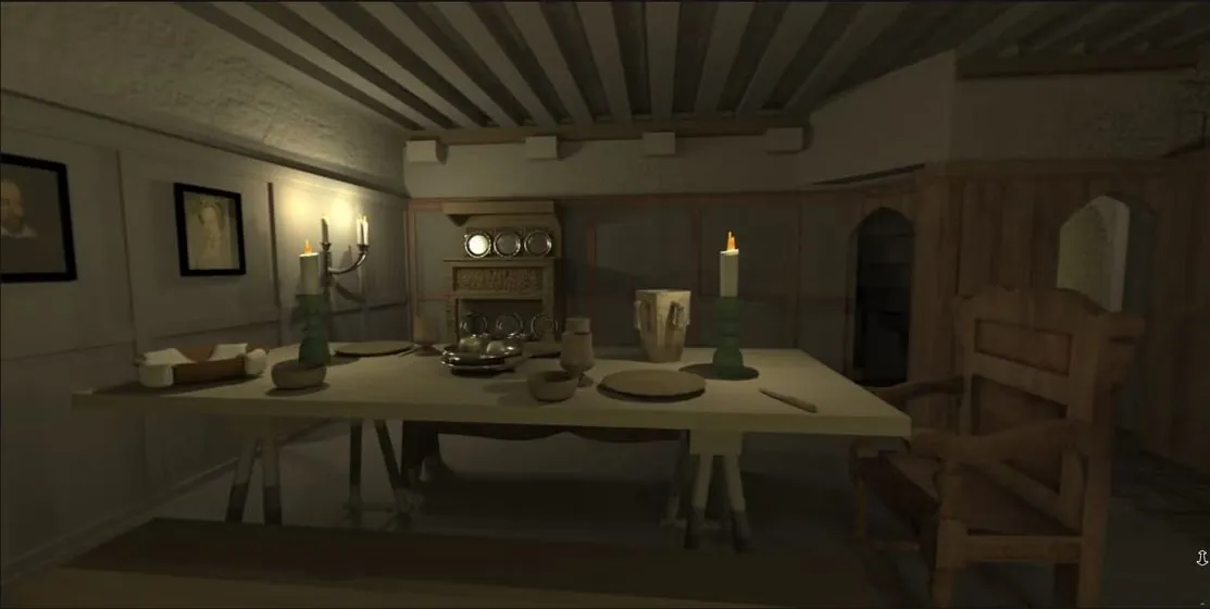
Images are from the Centering Spenser project, led by Thomas Herron at East Carolina University.
Centering Spenser is led by Professor Thomas Herron of East Carolina University, and his team at the university’s Multimedia Center built the castle model. The project asks how Spenser’s role as a colonial settler in Ireland shaped his writing. In Fall 2020 I took Ireland: Land, Conflict, and Memory at Carleton. Its professor, Susannah Ottaway, is one of the project’s main collaborators, and she invited her students to suggest additions to the model and give honest feedback. The project later received an NEH grant to grow.
This work left me with questions I still ask in product work: who is this for, how do you stay accurate and still make it easy to approach, and how do you keep something fun while it teaches.
I’m a design-oriented product leader passionate about technology as a medium for storytelling. My work focuses on crafting immersive and interactive experiences that connect people.
Right now I’m the founding Product Manager at Variant, an AI-native creator platform where anyone can dream up and publish interactive games and stories. I took it from a 2-person team to a live iOS and Android product with 20+ people across product, design, and engineering in six months: writing the specs, running the research, and building the analytics stack (PostHog) that tells us what’s actually working. I also stood up a university developer fellowship to bring the next generation of creators onto the platform.
Previously, I was a Senior Product Manager at Electronic Arts on a mobile title within The Sims franchise. I owned the creative economy of the game: the character customization and home decorating content that let players express themselves and tell their own version of a story. I ran the studio’s player research end to end, which drove a 28% lift in early player retention. I also led a large-scale A/B test across more than a million players that lifted average revenue per user by 9%.
My work is about bridging design, user insight, and product strategy: building things that are thoughtful and human first without losing sight of the business behind them. That instinct goes back to earlier work in the digital humanities, where I built digital research tools and public history exhibits. I have an M.S. in Human-Computer Interaction from the University of Michigan and a B.A. in History from Carleton College, and the throughline has been the same: using technology to help people tell and experience stories.